 Evaluating the Usability of Jamovi: From Human Cognitive Traps to AI Agents
Last term, a UX researcher from Google taught our graduate Research Methods course. She gave us free rein to pick any product we fancied and guided us through a full three-month user experience research cycle from soup to nuts. I thoroughly enjoyed every minute of it, eventually walking away with a clean 100% in a course where the class average hovered in the mid-80s. Rigorous, textbook-style usability research isn’t something you run across every day, so I figured it was worth documenting properly.
I chose Jamovi, an open-source statistical package. Part of it was my long-standing appetite for data analysis, but part of it was my identity as an open-source contributor. Dedicated UX research in open-source scientific software is practically non-existent. Giving back to that ecosystem felt like a genuinely worthwhile endeavor.
UX pioneer Jakob Nielsen noted back in 20001 that in qualitative usability testing, five participants are typically enough to catch roughly 85% of core usability issues. Given limited bandwidth, I recruited six participants for Phase One. As it turned out, six people won't give you quantitative statistical power, but they produce a treasure trove of qualitative friction. In Phase Two, I brought in three UX design graduate students as domain experts to run cognitive walkthroughs and heuristic evaluations. In Phase Three, I tested whether newly minted AI agents (equipped with visual "eyes" and mouse-controlling "hands") would stumble over the exact same cognitive traps.
Together, the three phases formed a neat progression:
- Phase One caught the behavioral paradoxes in actual users;
- Phase Two traced those symptoms back to upstream cognitive bottlenecks;
- Phase Three stress-tested whether AI agents inherit the exact same design traps.
Nielsen Norman Group remains essential reading for anyone doing empirical UX research.
Study 1: The Human Usability Test
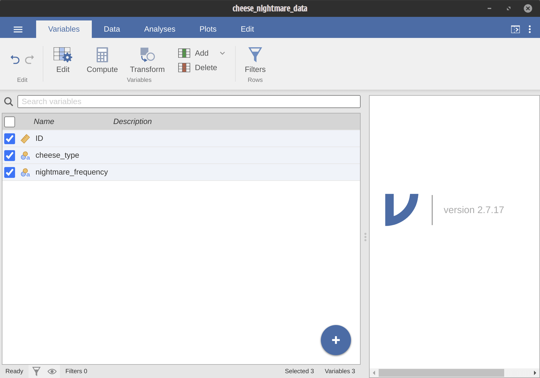
To test whether Jamovi’s interface helps or hinders analytical accuracy, I leaned into a quirky statistical education classic: the "Cheese and Nightmares" experiment. Six participants with STEM backgrounds played the role of sleep researchers, using Jamovi to answer a simple question: does eating different types of cheese before bed affect nightmare frequency?
Everyone had taken college-level statistics, but none had more than five hours of Jamovi experience. In practice, because Jamovi is relatively niche, nobody had ever touched it before, which made our variable control wonderfully clean.
The synthetic dataset had 100 records and two pre-planted traps:
- An extreme numeric outlier (row 10, value
200instead of2). - A subtle format typo in row 60 where a
3was typed as3a.
That second trap is insidious: a single stray letter causes Jamovi to quietly classify the entire column as nominal text, triggering an avalanche of downstream errors.
The experimental workflow was divided into four tasks: Data Import (T1), Data Cleaning (T2), One-Way ANOVA (T3), and Result Visualization/Interpretation (T4).
Turning Qualitative Rants into Quantitative Data
Participants followed the Think-Aloud protocol, narrating every thought as they worked. Think-aloud data is rich, but as someone who enjoys empirical rigor, I wanted hard numbers. I designed an atomic event coding scheme covering error types, severity levels, task phases, and recovery strategies across six dimensions.
To eliminate subjective human bias, I offloaded the initial event coding to three LLMs: DeepSeek v3, Gemini 2.5 Pro, and Grok 4.1. Each model independently coded each participant’s session transcript five times, generating 15 independent coding passes per subject. Inter-coder agreement ranged between 0.836 and 0.888 across all six participants, comfortably above the standard 0.80 reliability threshold. Whenever agreement dipped below 0.90 on a specific event, I stepped in as human arbiter, checking the screen recording and raw audio to make the final determination.
The Core Paradox
The data immediately surfaced a striking contradiction:
Subjective mental workload (measured via a modified NASA-TLX scale2) averaged a remarkably low 19.83 out of 100. Participants felt relaxed, comfortable, and unburdened. Yet the System Usability Scale (SUS) score was a lackluster 62.9, falling below the industry benchmark of 70. Across just six participants, we logged 70 distinct error events.
Due to researcher oversight, the questionnaire omitted the "Performance" subscale. As a result, this score cannot be directly compared to standard norm databases, serving instead as a relative workload index among participants.
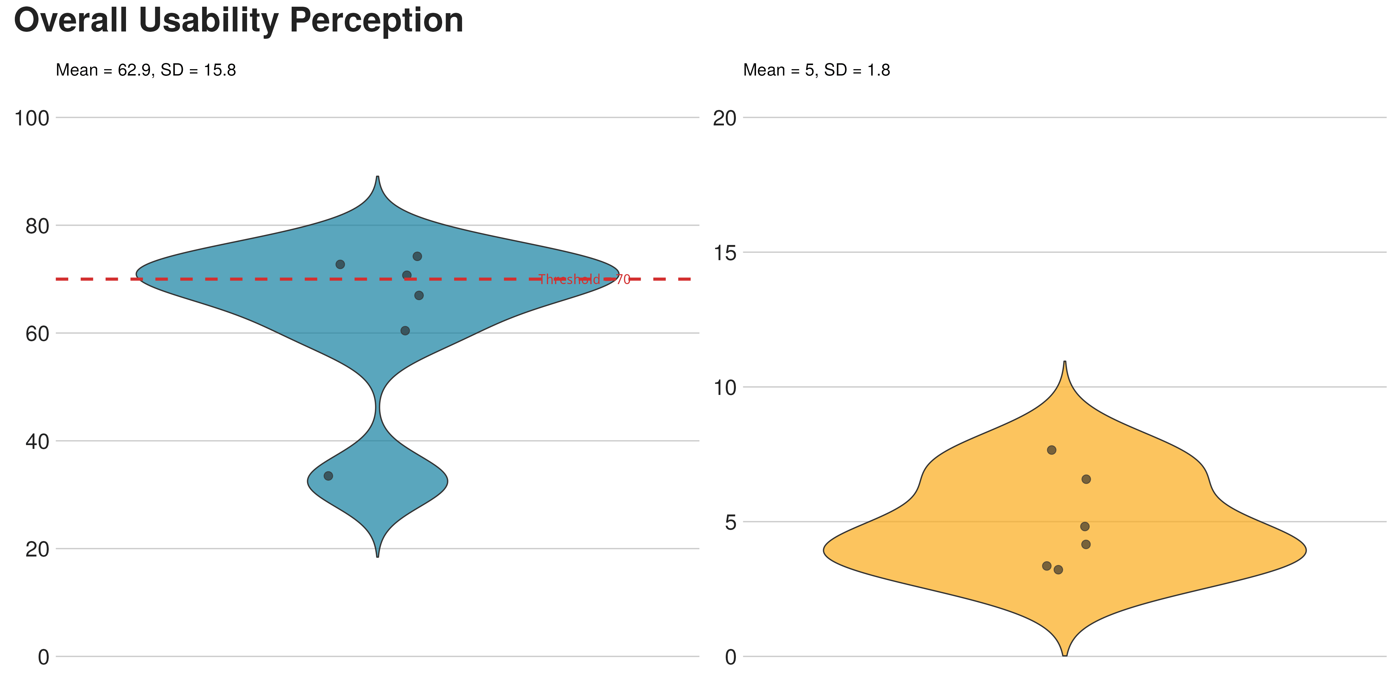
Users felt completely at ease while steadily driving the car straight into a ditch. That paradox became the guiding thread for the rest of the research.
Four Error Clusters
A K-means clustering analysis sorted the 70 error events into four distinct profiles:
1. Missing Feedback on Invalid States
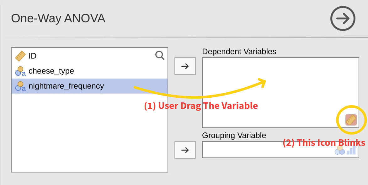
This was the single most common failure mode. When participants tried dragging an uncleaned text column into the Dependent Variable slot, Jamovi’s only response was a faint, fraction-of-a-second icon flicker.
All six participants saw the flicker. Exactly zero understood what it meant. One participant explained: "When it wouldn't drop in, I was totally lost. What does the blinking mean? I knew it belonged there, and it took me two minutes to realize the variable type was wrong." Another noted that "the little ruler icon was blinking, but I had no clue why." Participants routinely repeated the same failed drag-and-drop motion three to five times in a row, completely unable to diagnose the issue.
2. High-Risk Workarounds Born from Cognitive Dead-Ends
This was the most dangerous failure mode. When participants couldn't drop the real dependent variable into the box because of the data type mismatch, they looked around for anything else that might fit. Eventually, they grabbed the only other numeric field available: the participant row ID.
One participant walked through their thought process: "I picked ID as the dependent variable because according to the icon in the corner, it had the little ruler symbol."
Jamovi happily executed the ANOVA without a single warning. The participant was presented with a pristine, authoritative statistical output, and on that basis, confidently reported a completely bogus research conclusion3.
We later ran an experimental statistical literacy workshop centered around Jamovi, and this exact trap surfaced at least twice more. It is a genuine systemic vulnerability.
3. Mental Model Clashes
Participants instinctively projected habits from other software onto Jamovi. One researcher repeatedly tried copying and pasting ANOVA tables directly back into the raw data grid to inspect them side by side, a standard move in Excel that collided awkwardly with Jamovi's clean separation between data and analysis panes.
4. Premature Task Completion
Participants tended to skim the data sheet and jump straight into modeling. After deleting the obvious 200 outlier, one participant declared: "Quick glance, saw the issue, deleted it... good to go." The 3a formatting error went entirely unnoticed. Across all six participants, only one person independently spotted and cleaned 3a.
The P-Value Trap
Five out of six participants, upon seeing a p-value greater than 0.05, concluded that "cheese has no effect on nightmares." They equated absence of statistical evidence with evidence of absence.
This is not a personal failure; it is an academic epidemic. A famous 2019 commentary in Nature signed by over 800 scientists pointed out that across 791 articles in five top journals, roughly 51% erroneously claimed that non-significant results meant "no effect." Our small-sample misinterpretation rate (83%, 5 out of 6) aligns squarely with the literature. When college statistics courses and peer review fail to stamp out a conceptual error, interface design cannot afford to be passive.
Study 2: The Expert Diagnosis
Study 1 surfaced the symptoms, but left the mechanics unexplained: why did users perceive the task as effortless while repeatedly making critical blunders?
To find out, I recruited three UX design graduate students. All three had backgrounds in psychology or economics, meaning they understood statistical concepts like ANOVA but had never used Jamovi before. This "domain-fluent, tool-naive" profile allowed them to objectively simulate an educated user's mental model.
PURE Cognitive Walkthrough
The Pragmatic Usability Rating by Experts (PURE) framework scores the cognitive effort required for each individual step in a happy path (1 = effortless, 2 = moderate cognitive load, 3 = high cognitive friction / likely failure).
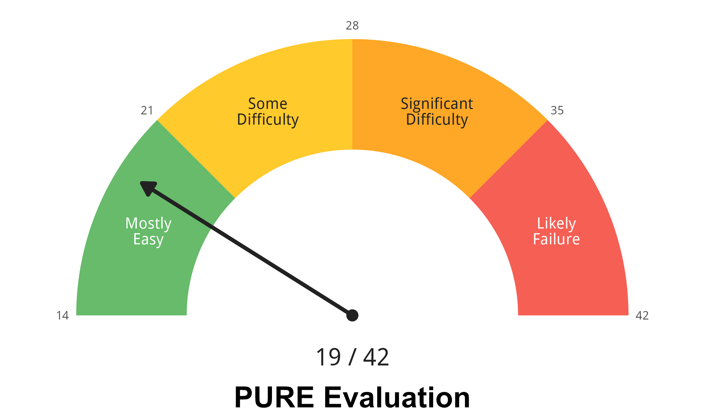
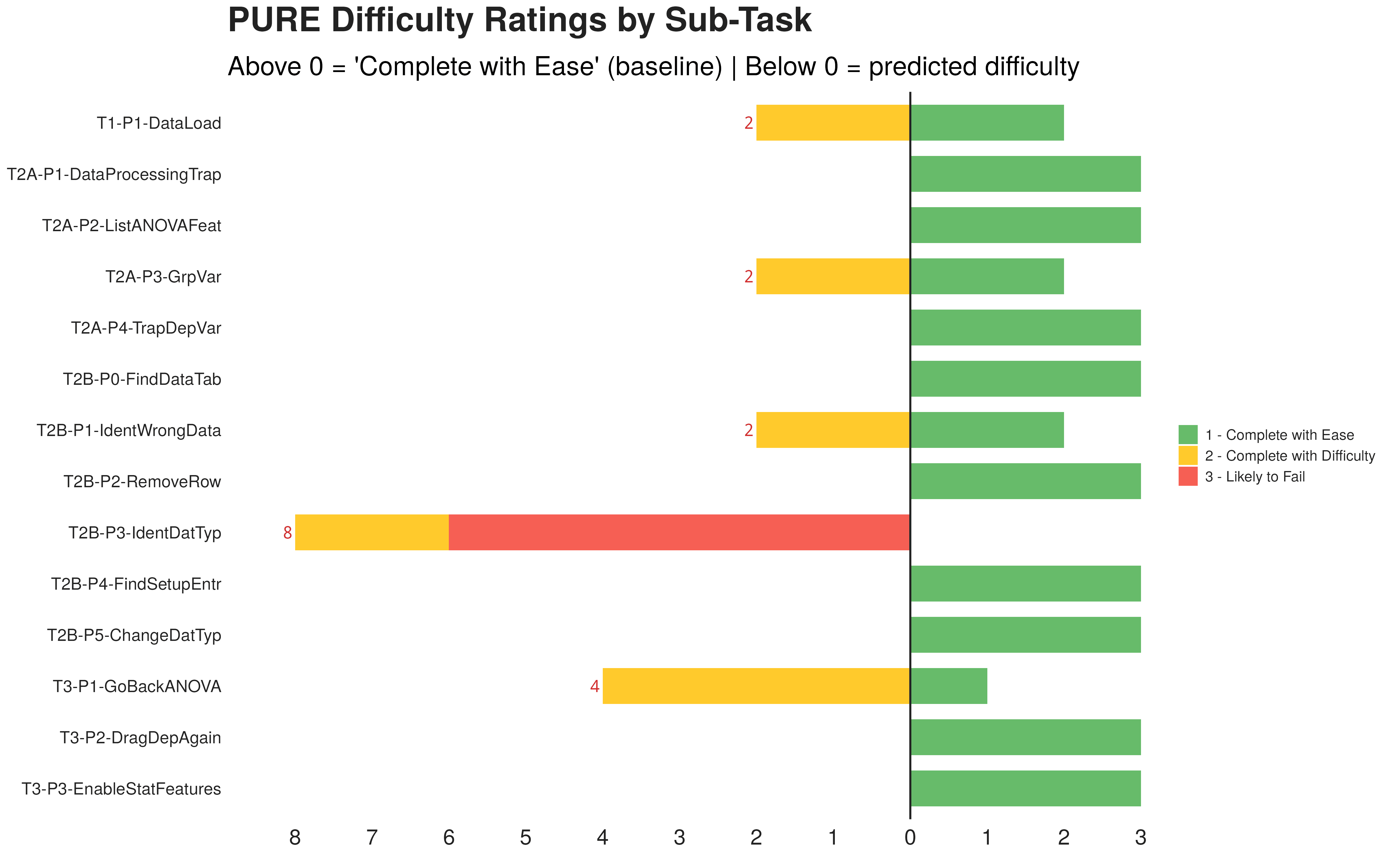
Overall, Jamovi scored 19/42 on PURE, nominally a "mostly easy" system. But one step stuck out like a sore thumb: "Identifying data type errors" was the sole step to receive a maximum friction rating of 3 (likely to fail).
That step involves zero physical clicks; it is purely deductive reasoning. The user has to spot a microscopic icon in the column header and deduce that the column type flipped to text. One expert noted: "If you hadn't pointed it out, I would never have guessed that was an interactive icon... I thought it was static decoration." Another admitted: "All I can tell is that this column shares an icon with column two... users are going to be baffled."
Heuristic Evaluation
Next, the experts evaluated the interface against Nielsen’s 10 Usability Heuristics.
The aggregated ratings showed that "Help and Documentation" (9/12) and "Error Recovery" (8/12) were the most severely violated heuristics. One expert gave Help and Documentation a severity score of 4 (catastrophic): "When an error happens, you're on your own. Usually you expect a help icon or a search box, but there's nothing here."
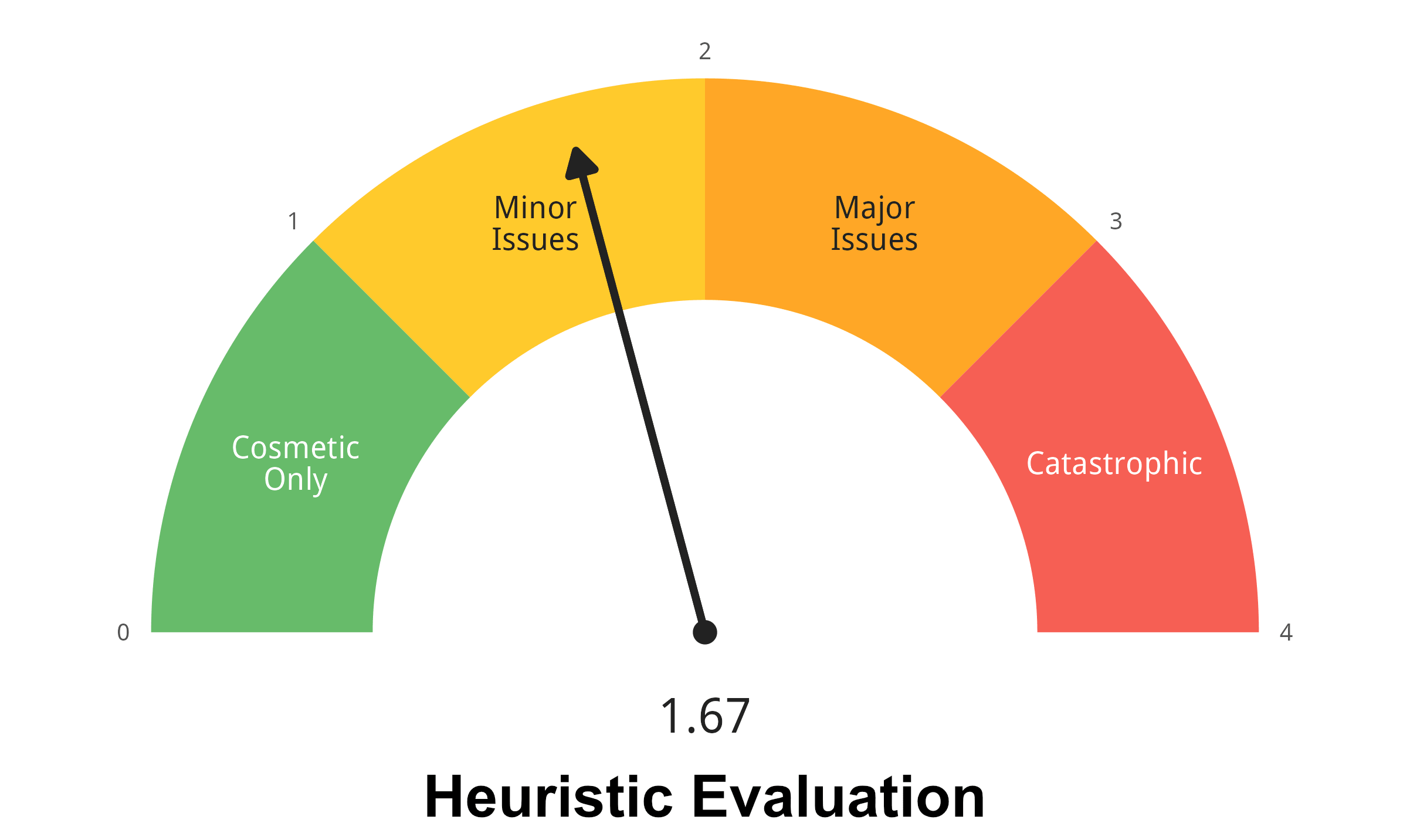
Interestingly, baseline mental models skewed the heuristic scores. For the "Consistency and Standards" heuristic, an expert coming from an Excel background rated it a 4 (severe issue), while an expert accustomed to SPSS rated it a 0 (no issue at all). Depending on which tool you compare it to, Jamovi feels either completely foreign or refreshingly modern.
The Cross-Analysis: Tracing Error Propagation
This was the decisive finding of the entire research project.
If you read my earlier essay on information design in UX research, you might remember the four-layer diagnostic model: Heuristic Elements, Cognitive Processing (PURE), Subjective Experience (Surveys), and Behavioral Events (Logs). That framework was born right here.
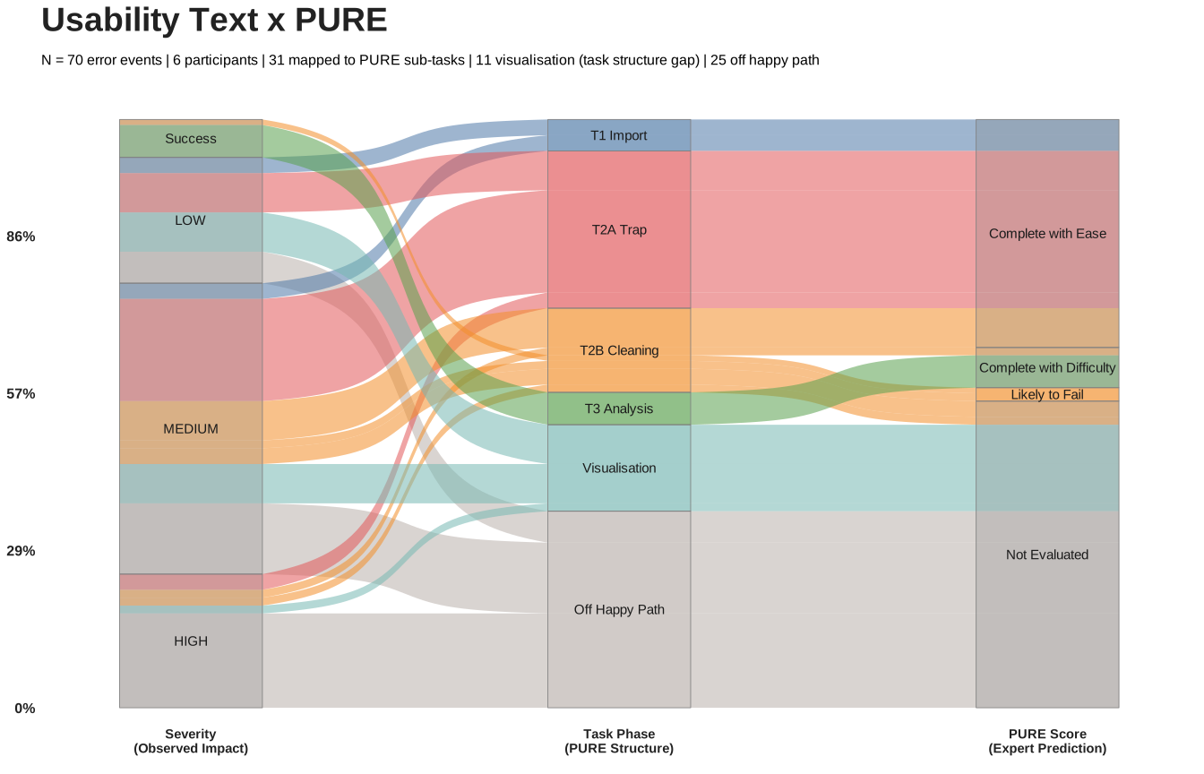
We mapped the 70 discrete error events from Study 1 onto the 14 PURE steps from Study 2. The distribution was counterintuitive:
29 out of 70 errors piled up on the "Drag variables" step, which had a PURE rating of 1 (effortless). Meanwhile, the "Identify data type" step, which scored a fatal 3, recorded almost zero behavioral errors.
Did users find data type identification easy? Not at all.
"Identification" is a silent cognitive process, not an interface click. It happens inside the user's skull. Screen recorders and clickstream loggers cannot record an event named "User failed to notice column icon." But that invisible cognitive omission festered upstream until it detonated downstream as repeated, frantic dragging failures.
Three distinct behavioral trajectories confirmed this mechanism:
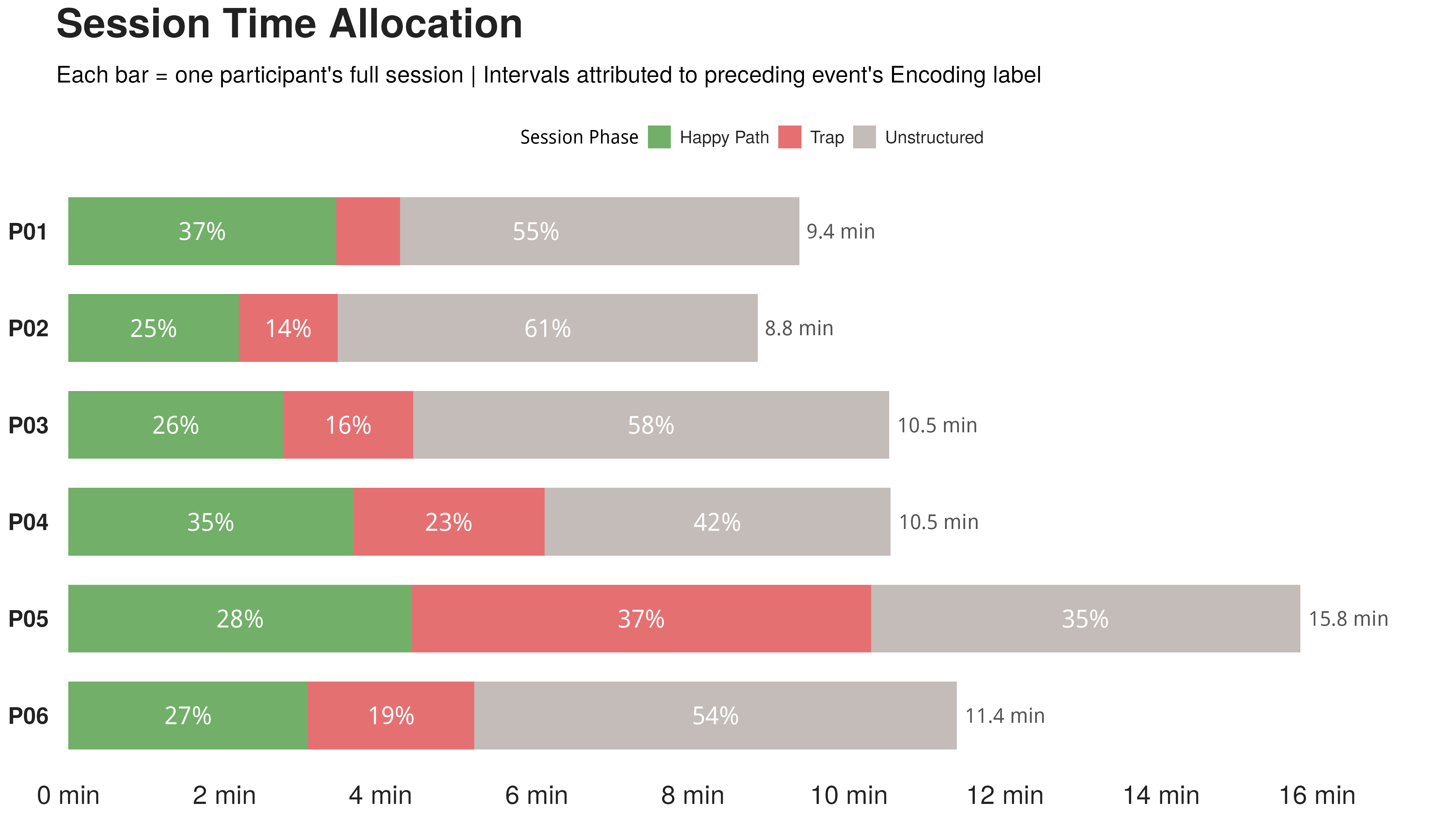
- Repeated Operational Spasticity: Participant P01 attempted the drag-and-drop action five times in a row, noted the blinking ruler icon without understanding it, and wasted nearly six minutes before accidentally stumbling into the variable setup pane.
- Wild Path Deviation: After repeated drag failures, participant P03 began trying random alternatives: dragging the ID column, attempting a non-parametric ANOVA, switching to an independent-samples t-test, and bouncing back to non-parametric ANOVA, cycling through four analytical tools in five minutes. All this flailing stemmed from one unmade deduction: they never recognized the data type mismatch.
- Silent Catastrophic Success: Participant P02 also failed to identify the data type, but instead of flailing, grabbed the ID column as the dependent variable. The analysis ran smoothly, and they confidently recorded an absurd finding. They didn't feel like they failed; they successfully produced garbage.
Only two of the six participants independently diagnosed the data type issue. Across all sessions, nearly half of the total experimental time was burned on aimless exploration outside the intended workflow.
Study 3: The Agent Experience Test
Human users are messy and unpredictable. But what happens if we replace the carbon-based analyst with an AI agent equipped with visual perception and mouse controls? Can an autonomous agent get through the data workflow more reliably?
I spun up a declarative NixOS testing environment and a custom MCP server to test the practical boundaries of Computer Use agents4.
Before running experiments, we evaluated popular open-source Computer Use platforms. Almost all suffered from glaring engineering flaws: string concatenation bugs in API URLs that broke backend connections, or context compression routines that consumed more tokens than they freed until the runtime crashed. We ultimately chose AstrBot because it was the only platform with a bug-free dashboard, rock-solid MCP execution, and hookable context pipelines.
(For the theoretical framework underpinning Agent Experience, see Agent Experience: An Introduction.)
Computer Use Task Completion Rates
The agent setup ran on NixOS (for absolute reproducibility) with a custom Wayland MCP server capturing screenshots.
In Computer Use workflows, every tool turn captures a high-resolution screenshot that gets injected into the context window. Without intervention, accumulated image tokens will rapidly blow past context limits and exhaust VRAM. To solve this, we implemented a context compression hook in AstrBot that discards past screenshots immediately after the tool response is processed, retaining only the latest frame. This domain-specific lossy compression was essential: running Qwen 3.5 122B (int4) on an RTX Pro 6000 would otherwise run out of VRAM within two operations.
We tested seven systems: GPT-5.4-xHigh, Claude Opus 4.6, Claude Sonnet 4.6, Gemini 3.1 Pro, Qwen 3.5 35B, Qwen 3.5 122B (int4), and the DOM-based Page-Agent.js. The task was identical to the human test: inspect data, clean anomalies, configure one-way ANOVA, and report findings.
The overall completion rate was a sobering 1 out of 7. Only GPT-5.4-xHigh completed the workflow from start to finish.
The failure modes fell into four distinct buckets:
1. Unrecognizable Custom Widgets
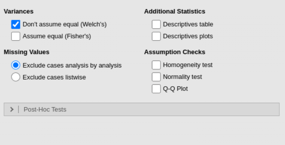
Claude Opus 4.6 correctly identified the formatting error and cleaned the column type, but once inside the ANOVA dialog, it failed to recognize Jamovi's custom accordion foldables, clicking repeatedly on dead areas. Custom UI controls fall outside standard web training sets, causing vision models to lose grounding.
2. Coordinate Inaccuracy
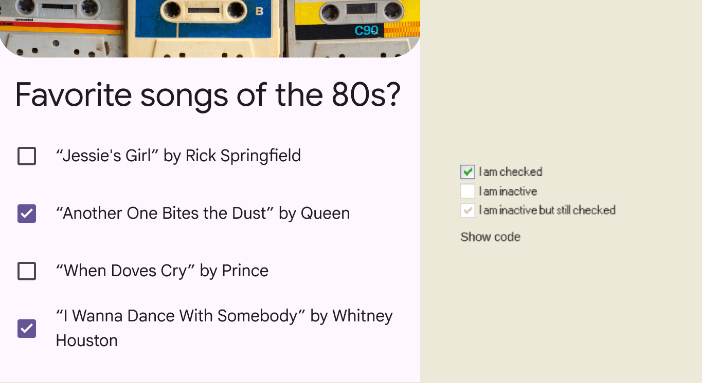
Claude Sonnet 4.6 repeatedly miscalculated button coordinates, eventually exhausting its tool turn budget. Even GPT-5.4-xHigh struggled to hit small checkboxes on the first try. Interestingly, Qwen 3.5 35B correctly pointed out the dirty data cells visually, but botched the mouse coordinate translation every time.
3. Infinite Exploratory Loops
When an off-target click landed Qwen 3.5 122B in an unexpected modal dialog, it clicked the exact same blank area dozens of times like a confused Roomba, completely unable to self-correct until the session timed out.
4. The Blindness of Pure DOM Trees
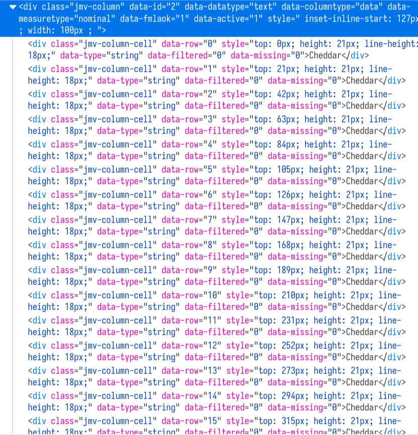
Page-Agent.js parsed the DOM tree of Jamovi Cloud instead of looking at pixels. As expected, raw DOM nodes failed to convey the spatial structure of the data grid. The model knew what elements existed, but had no idea how they were arranged spatially across columns and rows.
GPT-5.4-xHigh succeeded, but its interaction pattern was revealing: it batched multiple click commands in a single turn (requiring an event queue to serialize execution) and required several retries to check small boxes. This suggests that modern design systems like Material Design, with generous touch targets and prominent tap areas, offer significant ergonomic advantages for vision-based AI agents.
Evaluating Statistical Interpretation
Given how hard GUI manipulation proved to be, we asked a secondary question: Assuming an agent successfully runs the analysis, can it interpret statistical output without hallucinating?
We fed full screenshots of the Jamovi ANOVA results pane into ten different vision models, asking them to act as sleep researchers and draft an interpretation report. Each model ran five independent trials.
We evaluated them on two progressive hurdles:
- Gate 1: Did the model recognize that p > 0.05 does not prove no effect? (Asserting "cheese has no effect on nightmares" triggered an automatic fail.)
- Gate 2: Did the model refrain from making unsupported clinical recommendations (e.g., "cheese is safe to eat before bed") without equivalence testing?
Without hints, most models failed at least one gate across their five runs, falling into the exact same p-value trap as our human participants. Out of 50 total runs, only 28 passed both gates cleanly.
Then, we overlaid two simple sentences directly onto the results screenshot:
"Absence of evidence is not evidence of absence. Without formal equivalence testing, a non-significant p-value cannot be used to claim that groups are equivalent."
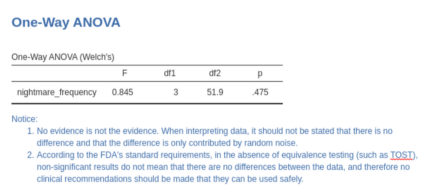
With the hint added, 42 out of 50 runs passed both gates. Excluding lightweight models like Claude Haiku and Gemini Flash, every frontier model surged to near-100% accuracy. We didn't build an elaborate prompt chain or fine-tune weights; we simply baked two lines of text into the image.
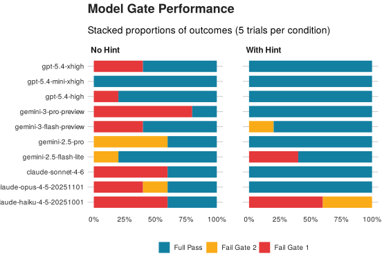
This finding has serious implications for interface design. Unlike busy humans who glaze over banner text, vision LLMs distribute attention across an image with monastic fairness. They don't need flashing banners or color contrast; plain semantic text is enough to steer their reasoning.
This highlights the true power of the interface as a context delivery mechanism: designers can inject domain expertise directly into the model's visual field at the exact moment of inference, something static prompt engineering and external APIs struggle to pull off.
Actionable Design Recommendations
1. Replace Blinking Icons with Persistent Error Messages
This was the universal consensus across all three studies:
- Human users in Study 1 couldn't decode the blinking icon.
- Heuristic experts in Study 2 rated Error Recovery as a severe violation.
- Screenshot-based AI agents in Study 3 were fundamentally blind to transient animations.
When a drag-and-drop operation is rejected due to a type mismatch, display a persistent toast or tooltip with three explicit components:
- What happened: "Cannot add
nightmare_frequencyto Dependent Variables." - Why it happened: "This slot requires continuous numeric data, but the variable is currently set to Text."
- How to fix it: "Double-click the column header to adjust data type."
In post-test debriefs, several participants reminisced about Microsoft's infamous Clippy. Clippy died because word processing is simple enough that an uninvited paperclip is pure annoyance. But statistical analysis is full of subtle methodological forks in the road. In complex analytical workflows, an intelligent, context-aware assistant is never redundant.
2. Embed Interpretive Prompts in Statistical Output Panes
Our third study proved that two lines of text can slash AI reasoning errors from rampant to near zero, while simultaneously guiding human users away from textbook p-hacking.
Jamovi should embed standard methodological notes below hypothesis test tables:
"p > 0.05 indicates the data does not provide sufficient evidence to reject the null hypothesis. It does not establish that group means are identical. To claim equivalence, conduct a Two One-Sided Tests (TOST) procedure."
Jamovi should also stop treating descriptive statistics, effect sizes, and boxplots as optional checkboxes hidden in submenus. Following APA reporting standards, these should be rendered by default. Making them opt-in creates cognitive omissions for humans and requires extra click coordinates for AI agents.
3. Implement Proactive Data Quality Checks
PURE singled out data cleaning as the highest-friction phase of the workflow, and our behavioral data backed that up.
Jamovi should introduce passive quality guards:
- When over 95% of values in a column are numeric but a handful contain letters, flag a subtle inline warning: "Possible data entry typo detected."
- When casting a column's data type, show an explicit preview of affected rows ("Converting will turn 1 value into NA: row 60 ('3a')") instead of silently mutating data.
- Draw inspiration from Minitab’s Assistant, which uses interactive decision trees to verify sample normality, sample size balance, and variance homogeneity before executing tests.
4. Overhaul Results Panel Information Architecture
Participants repeatedly lost their place in the output pane: clicking an analysis button created duplicate runs instead of editing existing ones, and right-clicking to remove a table sometimes wiped entire sections.
Jamovi can resolve this without abandoning its notebook metaphor:
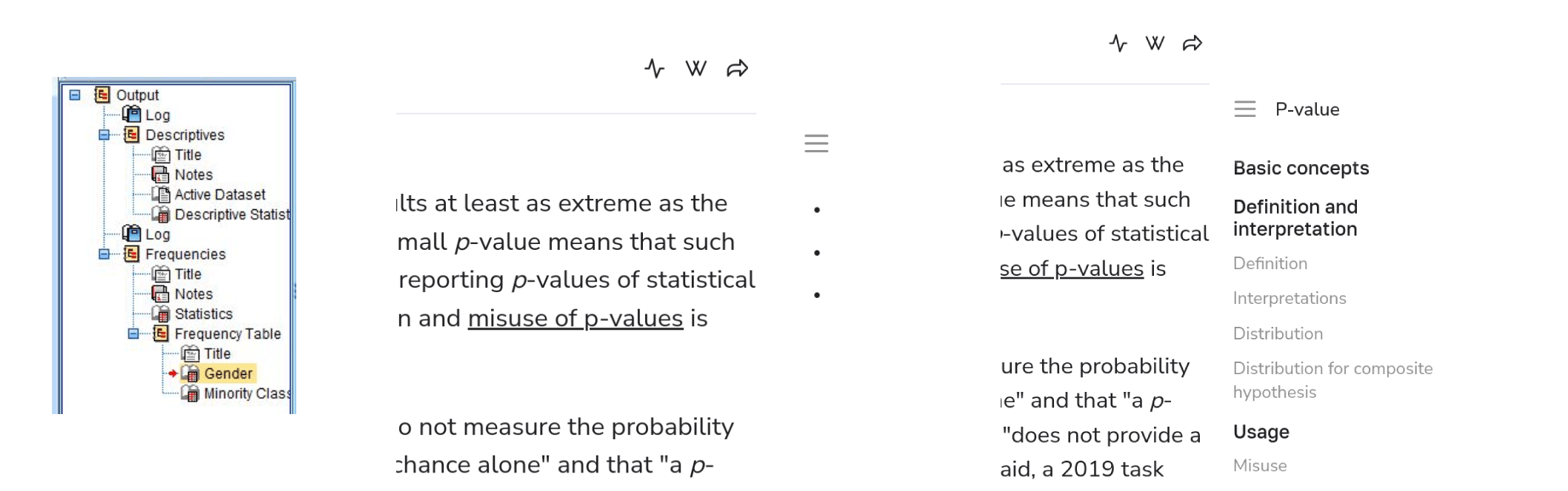
- Adopt SPSS’s two-pane outline view or Wikiwand’s floating table-of-contents dots, allowing users to jump directly between ANOVA runs and charts.
5. Add a Search-First Help System
"Help and Documentation" scored the worst across all heuristic evaluations (9/12). Modern productivity suites have largely moved away from static documentation PDFs in favor of search-driven action bars (like Office’s "Tell me what you want to do").
Given that Jamovi already borrows heavily from Microsoft’s ribbon design language, adding a unified command-palette search bar at the top would allow users to search both documentation and actions simultaneously.
Jamovi is an open-source labor of love built primarily by statisticians. Dedicated UX research in this corner of software is vanishingly rare. Designing statistical tools is extraordinarily difficult because you cannot assume a unified mental model—your users are arriving from Excel, SPSS, Stata, GraphPad, or R, each carrying distinct muscle memories.
I hope this research offers useful insights for the Jamovi core team and the broader scientific software community. If you're working on UX for open-source research tools, feel free to reach out and swap notes.