 Key Elements of Information Design in User Research Reports
We often assume that research is simply about collecting data. As long as we choose the right method, secure a sufficient sample, and ask the right questions, conclusions will naturally emerge from the data. It’s as if the researcher’s only job is to be an honest recorder, faithfully presenting what they observe, and the work is done.
But if you have actually conducted research, you know it never works that way. Data does not speak for itself. It just sits there quietly, waiting for you to decide how the pieces fit together. The way you interpret it determines how it presents itself. Give the same set of numbers to different people, and they can tell completely different stories. Some see chaos, others see structure, and some see nothing at all, simply pasting the raw tables into their reports.
The difference here is not in the data itself, but in how you look at it.
Research, especially when it comes to experience research, is not just a simple procedural workflow. It requires a systematic way of thinking. You need to know why you choose one method over another, why placing two types of data together creates tension, and why looking at the same phenomenon from different angles yields entirely different conclusions. More importantly, when data starts to conflict, you need to be able to find a logical thread through the chaos and get the different pieces back into a conversation.
Today, I would like to share some of my thoughts on this matter.
User Experience Is a Complex and Multifaceted Information Space
I want to invite you to reconsider how you build a research framework and structure a narrative through the lens of information design.
- Data is simple observation. It contains little thought on its own.
- If we take one more step and connect several pieces of data together, insights begin to emerge.
- A skilled researcher can look at the same thing from multiple perspectives. At that point, you start to see wisdom.
- Of course, if you skip research and rely purely on imagination, that is just pure conspiracy theory.
This bears some resemblance to the DIKW framework1, but to be honest, I only became aware of it after a colleague mentioned it. If you are interested, you can read about it on Wikipedia.

Let us start with simple data. A common approach to presenting research is to dump scattered observational notes and basic statistical results directly into the report, then top it off with superficial explanations. This is like simply reciting a list of dish names. Such a report shifts the responsibility of interpretation onto the reader, who then has to spend considerable time synthesizing and understanding the information. But as you know, not every reader has the mental energy to do that heavy lifting. The result is that we have put in significant effort only to produce a useless study.
To change this, we need to truly connect the data. You may already know many ways to connect data without realizing that you are actually creating insights. Some simple descriptive methods include using heatmaps to overlay two datasets to see patterns, grouped stacked bar charts to show proportional distributions, and alluvial diagrams to visualize how data flows between different states. If you are willing to invest more time, you can even use more complex analytical techniques like cluster analysis. Finally, for those with advanced data analysis skills, you can try methods that are a bit riskier but more powerful, such as ANOVA, linear regression, and chi-square tests. These techniques allow data to begin explaining itself.


But if you only have one perspective, your insights will have boundaries. That is why experienced researchers do something else: they bring in more groups of people, having different individuals look at the same thing. A typical user sits in front of a computer, staring at a software or website, feeling lost and confused. Every action they take can tell you exactly where the product is poorly designed, but this only tells you that it is not good, not why it is not good or what exactly is wrong. This is the user’s perspective: authentic, important, but limited. At this point, you might want to invite a few experts. These individuals have specialized training. They understand the fundamental elements of user experience design. They can see where the happy path is, what prevents users from completing tasks smoothly, and what elements are necessary for a good user experience. But experts also have blind spots. Once you have a professional lens, it is hard to go back to a state of not knowing. It is difficult to truly understand the bewilderment a beginner feels when faced with a blank screen. Once that veil of ignorance is lifted, it is nearly impossible to lower it again.
So you cannot rely on just one perspective.
Of course, if you do no research and rely purely on imagination, things can take a rather strange turn. This leads to what we commonly call the "clueless product manager’s trio: intuition, experience, taste, plus a DLC: self-delusion." I believe you already know this.
Research Methods Are Concrete Tools for Dissecting Information Spaces
In the field of user research, there are hundreds of methods. Observation, interviews, surveys, card sorting, heuristic evaluation, usability testing, contextual inquiry, field studies… the list goes on.
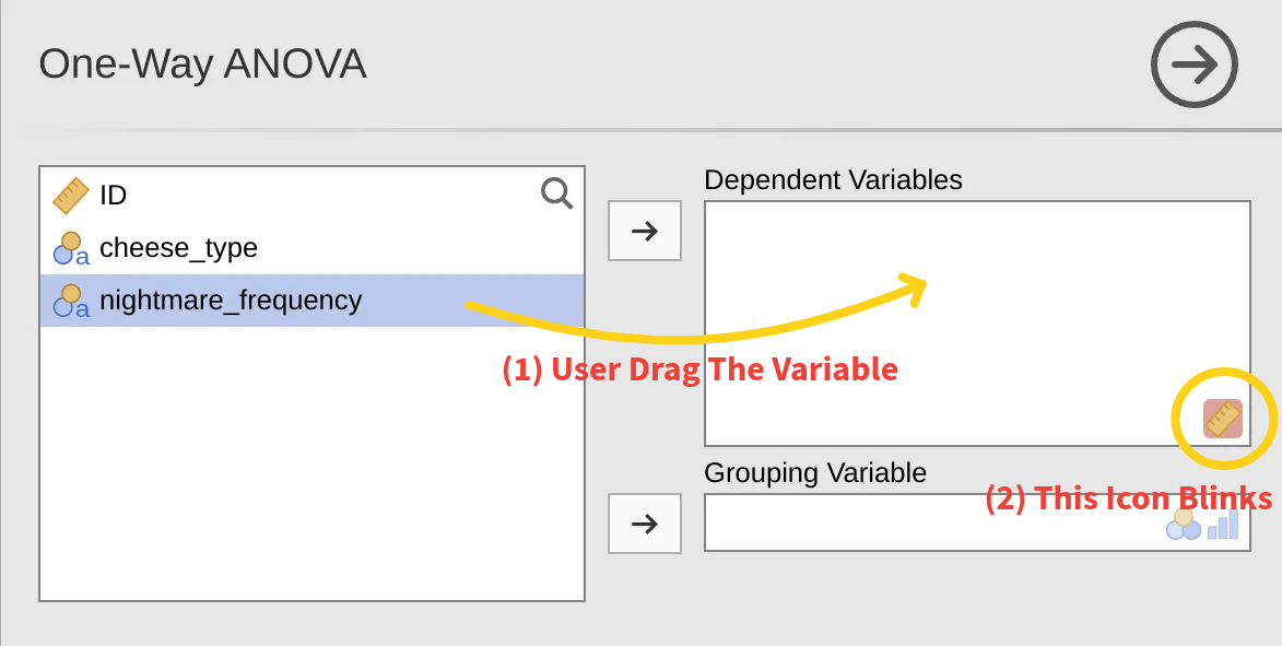
Suppose you are studying a software application. You want to know how smoothly people use it, where they get stuck, and how they feel about it. You have limited time and resources; you cannot apply every method. You need to make some trade-offs, using the fewest resources to obtain as much useful information as possible.
How do you choose?
The cheapest methods are always considered first. They do not require expensive equipment, do not wait for the product to launch to collect logs, and do not require pulling users away from their familiar environments to a lab. You might think, since you are studying software, why not just let users interact with it and see how they operate it. So you choose observation, combined with a think-aloud protocol, asking them to verbalize their thoughts as they go. This way, you can see both what they do and what they think.
You might hesitate: should I ask questions during the session? If you do, it becomes contextual inquiry, allowing you to ask "why did you click here" while they are operating. But you also worry: will questioning interrupt their flow? Could it inadvertently give them hints, helping them solve problems they otherwise would have faced? After weighing the options, you decide not to conduct a contextual inquiry for now, keeping the observation pure and letting them speak naturally. Questions about "what were you thinking then" can be asked after the tasks are completed.
You might wonder whether you should visit users’ offices to see how they actually use the software in their real environment, but something feels off. This is not a family-friendly product like a Nintendo Switch or Nex Playground, where the usage context is so singular that such an effort would be unnecessary.
Observing behavior alone is not enough. You also want to know how users truly feel about the software: do they find it difficult, tiring, or do they feel confident? So you pull out two standardized questionnaires from your toolkit. After they complete the tasks, you have them fill out these forms, which take just a few minutes. They will not tell you exactly where the problems are, but they will give you a sense of users’ subjective experience.
Now you have behavioral data and subjective data. But you also want to look at the software from another angle, not focusing on users, but on the software itself. You invite a few UX experts and ask them to walk through the happy path, to see where things fall short or where anti-patterns are introduced that cause confusion, frustration, and pain. Experts can understand the user’s mental processes from a higher-level perspective, assessing the cognitive load at each step and predicting which steps might fail. This process is not about users doing something; it is about experts thinking on behalf of users. You also ask them to go through the software against Nielsen’s ten heuristics, identifying which principles are violated and what elements are missing.
Data Integration Is Information Design
You have collected a large amount of statistical data and performed various analyses. Now you have many results. But how to weave them into a coherent report is another skill altogether. If you simply stack and list the different findings, the reader’s thoughts will jump around. This can be tiring, leaving them unsure where to focus and feeling confused. It is similar to the paragraph ordering questions in English exams. No matter how beautiful individual sentences are, if the order is wrong, the overall piece falls apart.
We need to ensure that one sentence leads naturally to the next, one paragraph to the next, with a clear argument throughout, culminating in a conclusion. This is where we can look to the basic principles of academic writing. In academic writing, you have a core question to answer. To answer it, you need to address several sub-questions, each supported by data. These pieces of evidence form a complete chain of reasoning that converges on a conclusion.
When answering a specific question about an experiment, you will often find that multiple sets of data contribute to the answer. For instance, you might have four groups of information: user behavioral data (what they did), user subjective data (what they felt), expert cognitive walkthrough data (their cognitive processes), and expert heuristic evaluation data (the strengths and weaknesses of the underlying elements shaping these cognitions).
Sometimes these data sets align, other times they conflict. To integrate them into a harmonious and cohesive whole, you need to plan the overall structure of your research.
You start by looking at the data from real users:
One type comes from questionnaires. The scales that users fill out after completing tasks tell you whether they found the software difficult, tiring, or if they felt confident. This is users’ evaluation of their own experience; we call it subjective data.
Another type comes from observation. Where users clicked, what they dragged, how long they were stuck, how many errors they made, all these were recorded. This is what they actually did; we call it behavioral data.
You notice that the questionnaires capture subjective feelings, which are the outcomes of behavioral experiences. There is a clear logical relationship here. When users repeatedly make errors at a certain point, their post-task ratings are also low. When an operation is smooth, users report feeling it was easy. However, if you only look at these two types of data, you can only see that a certain behavioral pattern correlates with a certain subjective evaluation. You cannot explain the mechanism behind this correlation. The thoughts users had while operating, how they understood the interface, what they thought they were doing, where they felt confused, these are not captured. Often, users themselves cannot articulate their own thought processes. Unless you can live inside a user’s mind or directly attach electrodes, this layer of information is almost inaccessible.
This layer is the cognitive process, and it requires different methods to capture.
Using the PURE method, you invite a few experts (typically three) to walk through the user’s action path, simulating what the user needs to understand, infer, and remember at each step. This is not about observing users, but about reasoning through the user’s cognitive process. Experts are trained to know what information is necessary, what is missing, and where users might get stuck. They can judge whether the cognitive load at each step is high or low, and which steps might cause confusion or even abandonment.
Experts assess the user’s mental model and cognitive processes, which in turn determine whether a user’s subjective experience with a software is positive or negative. This is a clear logical relationship. When you place these assessments of cognitive load alongside the behavioral data and questionnaire data you collected earlier, you find they connect quite naturally. The cognitive process drives the user’s subjective feelings. A user finds a step difficult because the cognitive load for that step is too high. A user feels confused because the interface lacks sufficient information for them to understand the current state. In other words, the level of cognitive load directly shapes the user’s subjective experience.
Now there is another question. What determines the level of cognitive load? Or, what determines the mental model?
This requires another type of analysis. The same experts, but this time, instead of focusing on the user, they look directly at the software itself. The various elements of user experience are clearly articulated in heuristic analysis. These elements collectively support the user’s mental model. They examine the software against fundamental UX design principles: Is feedback timely? Is the language clear? Is the interaction consistent? Is help available when errors occur? They assess how well the software’s design conforms to these principles, which in academia are often called heuristics, the fundamental building blocks of a good user experience.
The conclusions from the heuristic evaluation come before the cognitive process. If a software has deficiencies in basic elements like feedback, consistency, or error recovery, these deficiencies directly translate into cognitive load for the user. Users have to compensate for missing information on their own, guess what an icon means, or figure out why an action had no response. These extra cognitive efforts are the source of cognitive load.
At this point, a coherent logic for explaining the results begins to emerge. The complete chain of reasoning looks like this:
The basic design elements of the software, the ones identified by the heuristic evaluation, determine the cognitive load users must bear during operation, which is what the cognitive walkthrough assesses. The level of cognitive load directly shapes the user’s subjective feelings, which are what the questionnaires measure. And these feelings ultimately manifest in the user’s behavior, as recorded by observation.
These four types of data each fall at different points along this chain, combining into a logically rigorous system. When you arrange them according to this logic, you find they start explaining each other. Design deficiencies explain why certain steps have high cognitive load. High cognitive load explains why users find it difficult. Finding it difficult explains why they make repeated errors there. Conversely, you can also work backwards from the behavior. If you see users making repeated errors at a step, you can look back to see if there’s an issue at the feeling level, and further back to see if the cognitive load was too high, ultimately pinpointing which detail of the design elements caused it.
Of course, the researcher has the discretion to choose the interpretive framework. I dislike templates. The analytical process described here is not meant to provide you with a template. All the elements within it can be swapped out based on your research methods, as long as you ultimately construct a coherent narrative. It’s like playing with tangrams. One person might form a boat, another a flower, another a sun. There is no right or wrong here; it is simply a matter of different perspectives on the same thing.
For instance, one might argue that the cognitive process should be placed between behavior and ratings: the experts’ judgment of cognitive load fills the gap between actions and feelings. Behavior is externally visible, feelings are retrospected, while the cognitive process occurs in between, encompassing what users thought, guessed, and found confusing during the operation. This is not directly recorded, but it serves as the bridge connecting behavior and feeling.
This is my personal view. As long as your logic is sound, how you explain it and the order you choose are entirely up to you. Everything should serve the goal of solving the problem and telling a good story.
Solving an Actual Problem
Now you have four sets of data. You think you are ready to start writing the report. But when you put them together, you find they contradict each other. What do you do then? This is a real dilemma I encountered recently.
A while ago, I conducted a user experience study on Jamovi, an open-source statistical software. You can think of it as a free tool that resembles SPSS but is more modern.
Software like this has a specific user group: people who understand statistics but may not be adept with software. A psychology graduate student might know what ANOVA is, but when opening Jamovi for the first time, they need time to figure out "where is this button" or "how do I drag variables in." This is one angle for studying Jamovi.
Also, open-source software often has another characteristic: its designers are typically statisticians or programmers, not necessarily UX designers. So it might have some rough edges that are functional but not smooth. Jamovi is relatively well done, but there are still issues worth exploring.
During the study, I encountered a series of contradictions that were initially difficult to explain:
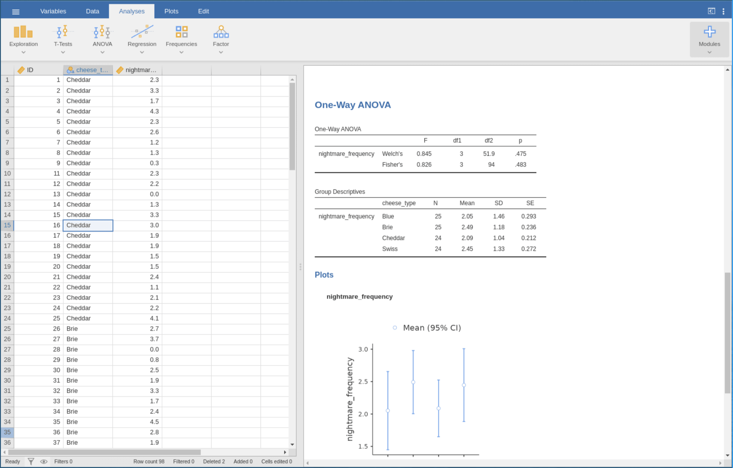
In the first round of the study, six people used Jamovi to perform an ANOVA. I recorded their screens, noted their actions, and sent out questionnaires after they finished. The questionnaire results were quite good. Users did not find the software difficult, and the task load seemed low. But when I reviewed the recordings, I found a high error rate. One user dragged the same variable into the box five or six times without success. Some tried a few times and then gave up entirely. Others used the wrong variable without realizing it, copying and pasting the analysis results back into the data area and submitting them as their final output. This was a mismatch between subjective experience and objective performance.
In the second round, I invited three UX experts to analyze the same software using two methods. One was the PURE cognitive walkthrough, where experts simulated the user’s cognitive process and rated the difficulty of each operational step. The other was heuristic evaluation, where experts assessed the software’s design quality against Nielsen’s ten principles.
After obtaining the results, new contradictions emerged.
The PURE evaluation indicated that most steps scored 1, meaning users could complete them easily. Only one step scored 3, indicating a risk of user failure or abandonment: identifying the data type error. This step involved no concrete action; it was purely cognitive: users needed to realize that "the data type for this variable is text and should be changed to numeric."

But looking back at the behavioral data from the first round, the highest number of errors did not occur at the 3-point step. Instead, they occurred at a 1-point step: dragging the variable into the analysis box. This step accounted for 29 errors.
If you align the tasks from the two experiments individually, the overall data structure appears contradictory and difficult to interpret. However, if we lay out all the data we have and try to arrange them using the four-layer structure, we see a different picture. The behavioral layer comes from recordings, the subjective feeling layer from questionnaires, the cognitive layer from the PURE evaluation, and the experience elements from the heuristic evaluation.
First, look at the experience elements. The heuristic evaluation showed that "diagnosis and recovery" and "help and documentation" scored the lowest, meaning the system provides almost no assistance when users make errors. If you drag incorrectly, the icon merely flashes; there is no explanation.
This design deficiency directly explains the issue at the cognitive layer. Why was the 3-point step in the PURE evaluation, identifying the data type error, so difficult? Because this inferential task had to be completed by the user alone; the system offered no hints.
Failure at the cognitive layer is invisible. An event log would not have an entry called "user failed to identify data type" because it happens in the mind. But this invisible failure manifests at the behavioral layer. The user does not know why the variable won’t drag in, so they try repeatedly, leading to 29 drag errors.
Why were the subjective feeling scores calm? Because users were unaware of the cognitive task they had failed to complete. They did not find it difficult because they never realized they had missed something.
Now look back at the two contradictions.
The first contradiction, low subjective difficulty scores but high behavioral error rates, occurs because the cognitive layer failure is invisible. Users did not perceive difficulty, but their behavior tells a different story.
The second contradiction, the mismatch between where experts predicted difficulty and where users actually made errors, is because the 3-point step was a cognitive prerequisite. It had no direct operational counterpart, so its failure was not visible in the behavioral data. But because this prerequisite was not met, all subsequent operations dependent on it failed repeatedly. Therefore, errors concentrated on the 1-point step because it relied on the preceding 3-point step.
Both contradictions, when processed through this four-layer structure, become explainable.
Understanding the Mindset of Information Design
I have seen this situation too many times. A useful analytical tool gets developed, and then it is treated as a formula. The next group of researchers takes their data, mechanically fills it into the layers, and produces a report that looks professional, but the original problem the framework was meant to address and the relationships it was meant to reveal get diluted by the process of filling in the template. The framework becomes decoration, no longer a tool for thinking.
This is not a problem with the framework itself, but with how it is used.
That four-layer model grew organically from the research design and the data. The first round of the study produced two types of data: users’ subjective ratings and their objective behavioral records. They conflicted: the ratings said "not difficult," but the behavior said "many errors." The second round produced two more types of data: experts’ cognitive walkthrough and heuristic evaluation. They also conflicted: the step experts predicted as most difficult was not where users made errors; the step where users made the most errors was rated as simple by experts.
Four sets of data, conflicting in pairs. I needed a way to make them stop fighting and start a conversation.
So I started thinking about what these data were actually saying. They were speaking about different levels. The subjective ratings spoke about what users felt. The behavioral records spoke about what users did. The cognitive walkthrough spoke about what users needed to understand. The heuristic evaluation spoke about what the software provided. These four levels are not parallel. If I arranged them in a causal sequence, a structure emerged.
The software’s design elements came from the heuristic evaluation. They determined the cognitive load users had to bear during operation, which was what the cognitive walkthrough measured. The level of cognitive load shaped users’ subjective feelings, which were captured by the questionnaire ratings. These subjective feelings were the comprehensive experiential outcome of the user’s sequential actions, which were recorded in the behavior logs.
This structure helped me explain all the contradictions. The step that was hardest for users to recognize, identifying the data type error, was a cognitive task. It had no direct operational action, so its failure was not visible in the behavioral data. But because this cognitive task was not completed, all subsequent operations dependent on it failed repeatedly. Hence, the errors concentrated on the seemingly simple drag step. Users did not find it difficult because they never realized they had missed something.
The four-layer model was not an invention; it was a discovery. It was the simplest, most self-consistent explanation that my data could form.
If I now handed this framework to others as a template, telling them to apply these four layers in their future research, I would be betraying my own point. Because the next research project might have no behavioral data, might use field studies instead of interviews, or might study an online service rather than software.
Everything in this framework is variable. The number of layers can change, the content of each layer can be swapped out. The only thing worth retaining is the logic of explanation: the causal or interpretive relationships between different levels of data.
So what I want to share is not a universal report template, but a way of thinking. When you have data that conflict, you can ask yourself: at what level is each piece of data speaking? Which levels are causes, and which are effects? If you can draw such a causal diagram, you have your own framework.
The core essence of research methodology is not possessing a collection of fancy templates. It is the ability, when needed, to craft a logically coherent argumentative framework for the problem at hand.
The four-layer model I presented today is just the one I built. I hope what you take away from this is not the model itself, but the ability to build your own.
I know this has been a dense piece. Thank you very much for staying with me this far and keeping your sanity.
The DIKW framework is a model concerning data, information, knowledge, and wisdom, where each level adds certain qualities to the one below. The data level is the most basic, the information level adds context, the knowledge level adds "how to use," and the wisdom level adds "when to use." As such, the DIKW framework helps us understand the limits of analysis, significance, and conceptual work. It is commonly used in information science and knowledge management. Excerpted from Wikipedia.