This is a topic I have discussed at length with NovaDNG. We have had many debates and fantasies about it. Just a few months ago, we decided to turn those wild ideas into reality. Rune, a project aimed at recreating the essence of Zune using modern technology stacks, was kicked off.
In fact, I've attempted to develop a player more than once, but my limited technical skills and overly picky technical taste led to two or three abandoned projects. However, with the emergence of powerful models like GPT and Claude, building a "space rocket" is no longer an unattainable dream. If you’ve read the development report of Alice Run!, you should have an idea of how astonishingly these large language models can solve development problems.
Riding this wave, I embarked on a nearly frenetic development journey over the past few months.
Before diving into this article, I want to share with you what the Rune player looks like now:
Why We Do That
In this era of rapid technological advancement, many of us have been deeply moved by various products. Some people repeatedly toggled "Airplane Mode" when they first got their hands on an iPhone, just to admire the little plane icon flying in from the right side of the screen. Others were mesmerized by the spinning gears during an iOS update, or thrilled by the new frosted glass effect in Windows Vista. Some were even awed by the concept video of "Quantum Paper," heralding a new era of design.
I was among the first developers to implement Material Ripple on the web and the first to achieve high compatibility and performance with Fluent Reveal Highlight on the web platform.
In that golden age, a group of dedicated individuals would gather to discuss issues that seem absurd today. You might remember our critiques of the iPhone's injection-molded antenna, our surprise at Android's decision to integrate the three buttons into the screen, or our lament over the less than 2mm camera bump on OnePlus phones, thinking "it looks a bit too protruding."
When did this thriving scene begin to decline? Everyone might define this moment differently, but for me, it was with the release of iOS 7.
iOS7 will probably be really awesome when they do the visual design.
"It doesn't matter if you mess up the design, as long as you're big enough, it'll become acceptable." People seemed to take this revelation from the Pope, and since then, the dedication to design has dwindled.
Today, most "tech giants" have "visual artists" but lack "designers." Creating flashy visuals doesn't equate to high design standards; the primary design value of a platform is its ability to present content in an orderly manner. Unfortunately, no one seems to care. Otherwise, the ugly icon color adjustment feature in the new iOS wouldn't have passed internal design reviews and been presented to users.
Apple aligns with Microsoft in "free-spirited design," Google in "poor design documentation," and Microsoft in "bland, conservative dullness." People say "good design converges," but conversely, "poor design also converges."
Using Windows, which lags with every click, I can't help but wonder if Microsoft's designers, who praise Apple while using elegant Macs, have ever used their own creations. And did Luke Wroblewski, who played a role in dismantling Material Design, ever take the time to properly use Android?
The more excited someone is about the flourishing development of everything, the more frustrated they become when witnessing the collective decline in software engineering and hardware design quality.
Amidst this frenzy, I felt lost and defeated, eventually switching to devices like the Hisense A9 and Jelly 2, which encourage you to "stay away from your phone." Without love, there's no hurt, and I found inner peace.
"Criticism breeds hatred, and complaints solve nothing," my high school teacher once advised me, and it wasn't until I was thirty that I truly understood the meaning.
Abstract evaluations are meaningless; I needed to do something concrete. Whether the outcome is good or bad, I must at least prove my ideas tangibly. And this is the answer we've delivered.
How we do that
If we were to select the top five dreaming projects for independent developers, GTD series (TODO, accounting, time management, diary, calendar), editor series (note-taking software, writing software, Markdown editors), CMS and OA series (blogs, various management panels), and music players would definitely make it to the top four.
A quick search on GitHub reveals numerous half-finished repositories that no one maintains. In blogs that introductions of new software, these types of applications are inevitably regular features in every issue. It seems that "how to improve one's efficiency more effectively" has become an even hotter topic. "Farewell to efficiency, return to tools" has become a trend of sorts.
The constant emergence of such projects is due to two important characteristics: low technical barriers and a wide range of demand coverage. The former means that anyone with an idea can immediately start making something that "looks the part". The latter determines that developers must spend more effort to clearly define the boundaries of the project, that is, to clearly define what its connotative and denotative concepts are, what things to do, and what things not to do. Otherwise, the project will become a rabbit hole that can never be finished, and such projects will inevitably come to no good end.
Figuring out these two things may seem difficult, but at its core, there's only one question: What problem is this project I'm working on solving? This is also known as the Goal of Success.
The Goal of Success is a very important concept. If the initially proposed problem is satisfactorily solved, we can say that the product has reached a state of "functional completeness". At this point, developers can choose to set new goals, or choose to pause temporarily, view it as a complete product, and pursue other goals instead.
We rarely see developers declaring that their work has reached the "Goal of Success", which is indeed a pity. I have discussed this topic in detail in the book "Survival Manual for Contemporary Students". If readers are interested, I can make it available to you as a free trial reading someday, so I won't elaborate further here.
Our initial intention in establishing this new repository is to recreate the spirit of Zune through modern technology, extracting the bright spots of Microsoft's product design over the generations and weaving them into a product in a reasonable way. This is a design experiment where we hope to re-sort the sequence of Microsoft's designs, assuming that designs across generations evolved in a less jumpy way, and see how they would eventually converge on Fluent Design 2.
Let me clarify further: This is an experiment in product and user experience design.
The above discussion is already a highly operational topic. Next, we will deconstruct it into several sub-goals, which is both a projection of my personal will as the team founder and can be seen as the value system of the entire project:
- Answer the question "What should a Zune player look like in 2024";
- Explore a possibility of modernized listening experience;
- If energy allows, further answer: If Microsoft's Multi-platform Vision were still continuing, what this design might look like on computers, phones, and even smart watches and wristbands.
Based on this, we named the project Rune, embodying the metaphor and expectation of "Zune Revived".
What We Did
Currently, this project has reached its mid-stage. We have addressed the first two questions to some extent, and the answer to the third question is starting to take shape.
Conservative Visuals
During the interface design process, I have discussed design almost daily with NovaDNG. We share a consensus that the most recognizable designs from Microsoft are the visual elements of Zune and the Metro Design of Windows 8.
I completely understand why many people dislike the tiles; they appear rough and differ greatly from what you might have seen before. However, I have a strong fondness for this design style, as it represents a bold attempt. Metro Design reasonably continues the visual elements of Zune without losing the fundamental sense of order, and it even possesses excellent recognizability, which is crucial for a product and brand.
Based on this consensus, we established some basic frameworks and logic:
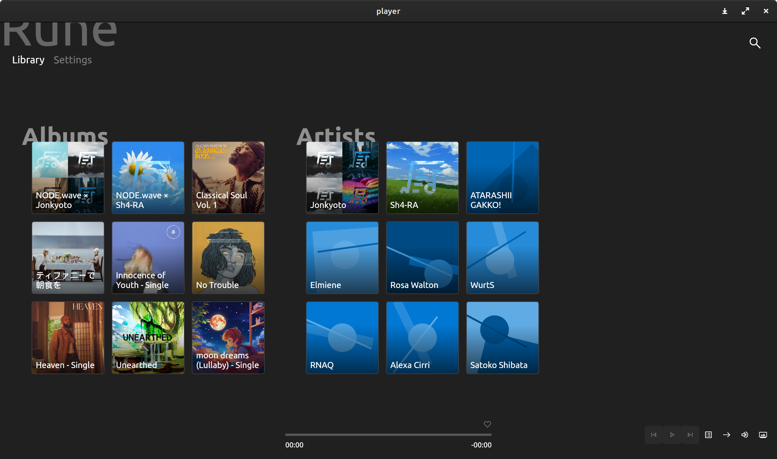
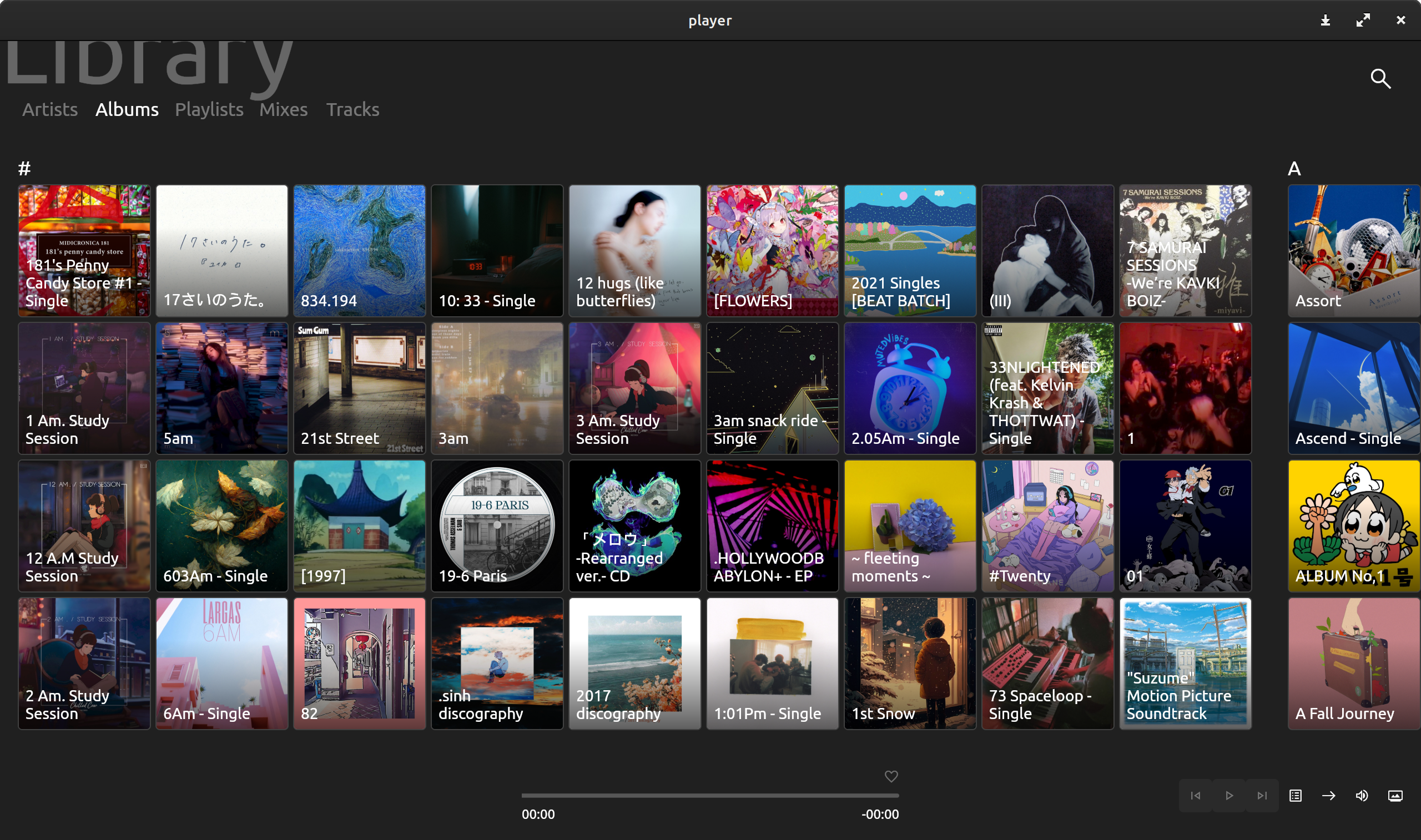
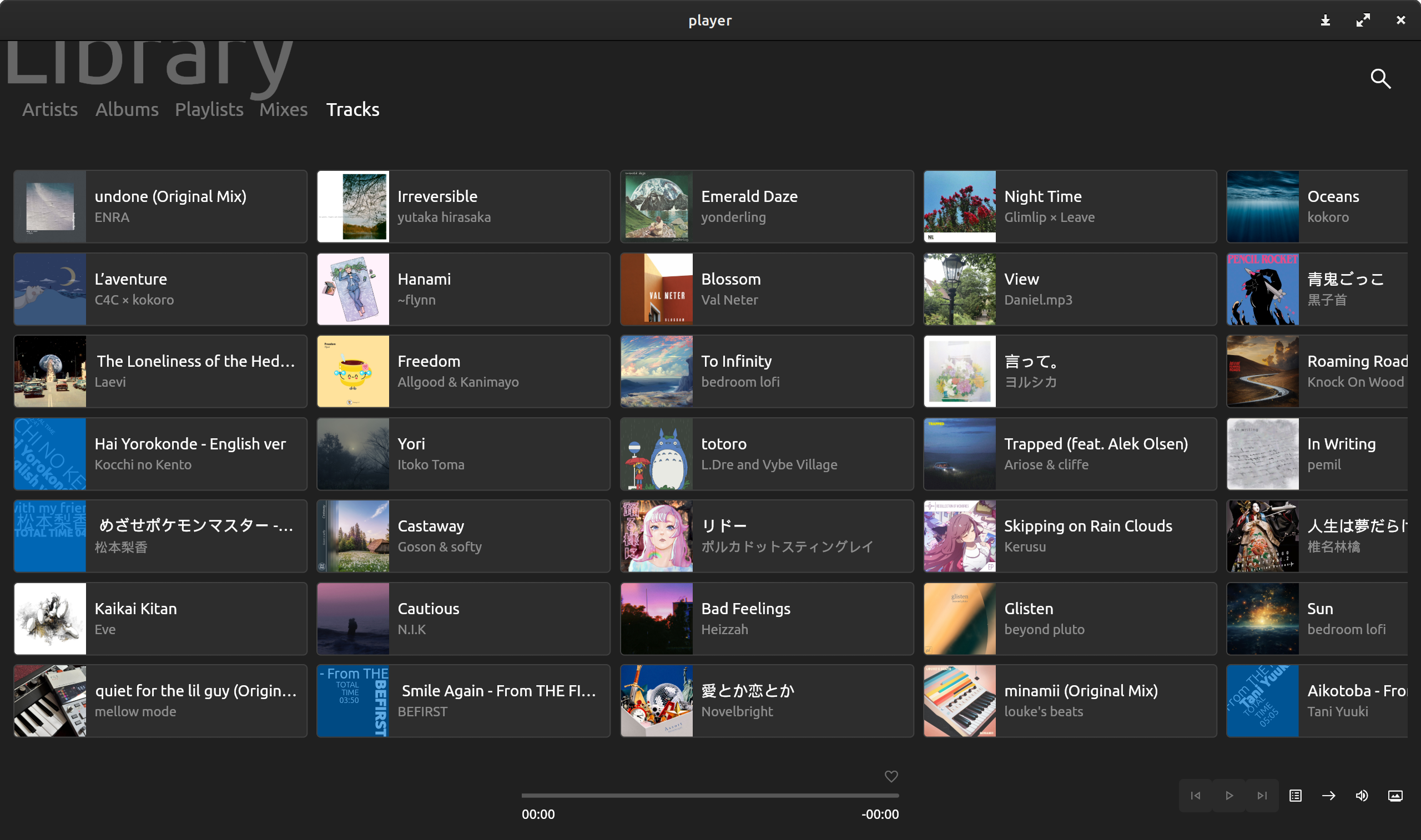
For some detailed elements, we referred to the visual style of Windows 10 Mobile, adding slightly less pronounced rounded corners to match the design standards of Fluent Design 2.
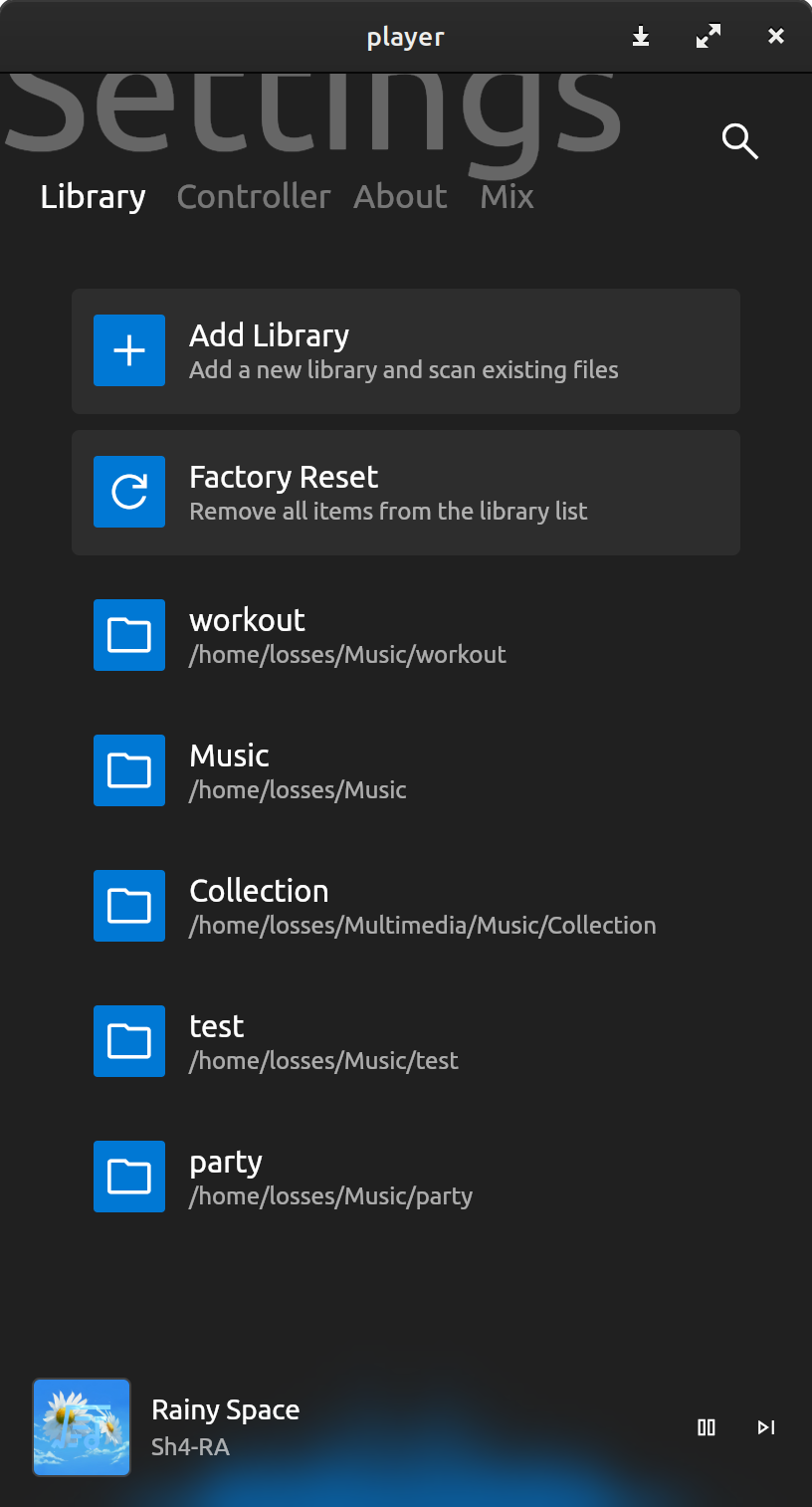
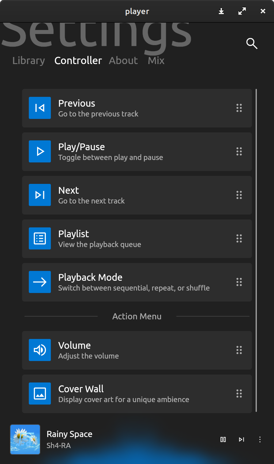
When discussing the most prominent aspect of Microsoft's design history, we cannot overlook the Reveal Highlight effect. To pay homage to it, we deliberately took some time to add a light animation that follows mouse movements to the cover wall interface. Although most of the implementation was based on publicly available code on the internet, the detailed color adjustments took quite some time. In the end, the brilliant visual effect made those late nights feel worthwhile. There were even nights when I opened my favorite songs and clumsily danced in my rented apartment, mesmerized by the fiery spectrum dancing on the screen.
I hadn’t felt genuine joy in a long time. Those few minutes of happiness, that deep-seated delight, even led me to wonder if I would want that as my companion in my final moments. This thought was indeed absurd, but it was my sentiment at the time.
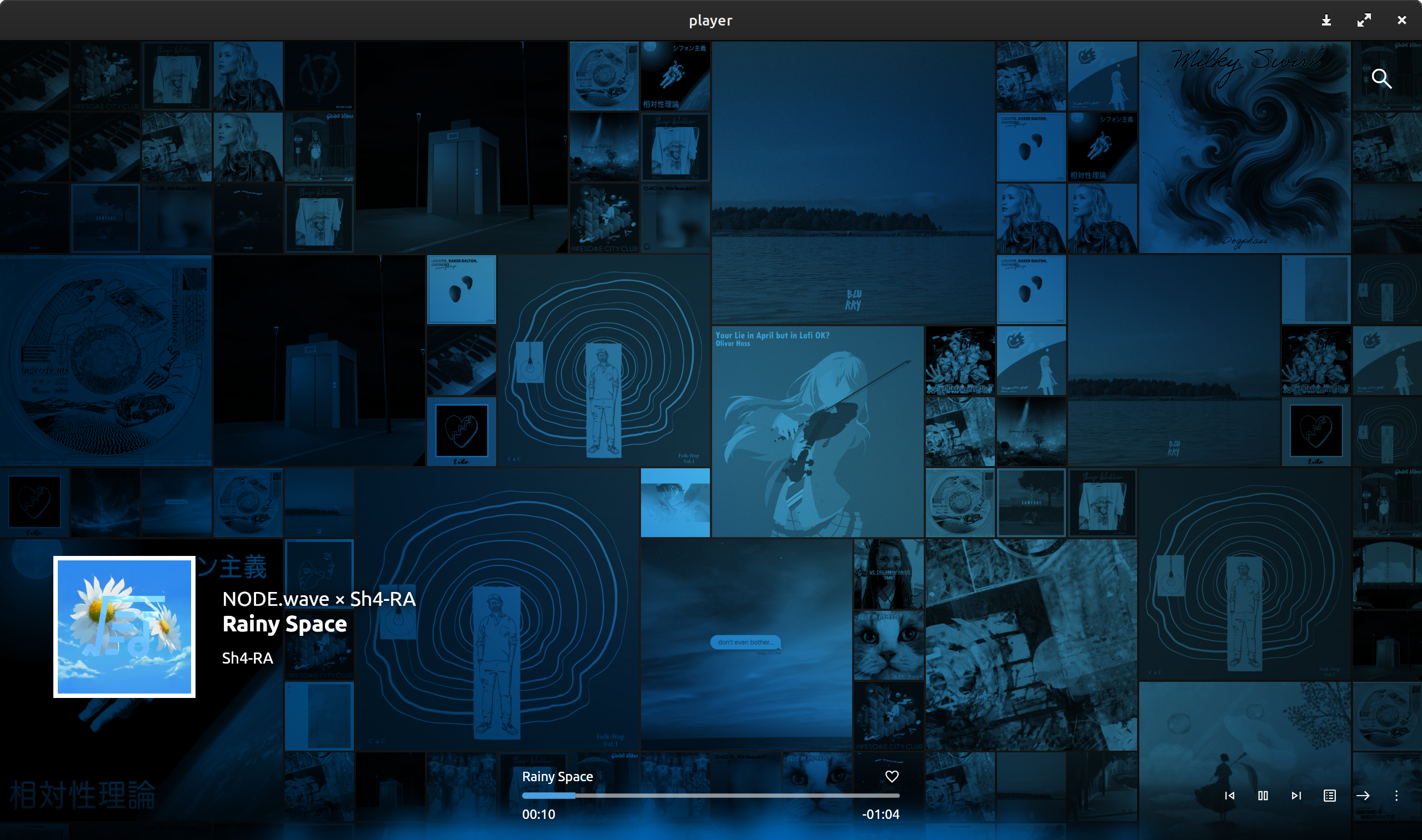
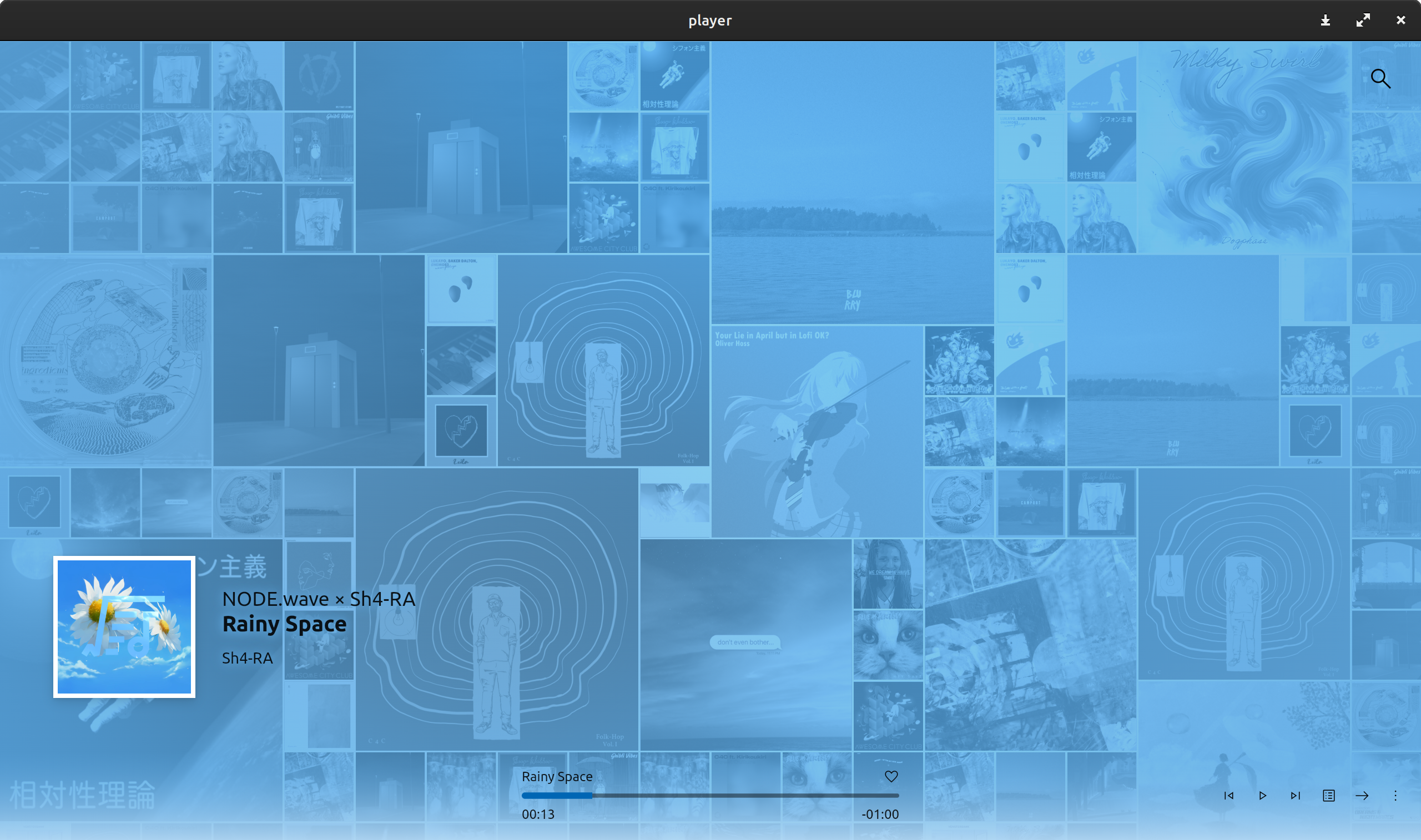
We are satisfied with the final visual style we presented, and friends from some Microsoft developer communities also responded positively.
Throughout the development process, everything progressed quite smoothly; we didn’t encounter any particularly troublesome engineering issues. If I had to mention something, the FLIP animation during the navigation bar transitions and page transition effects (which determined the fade-out direction based on routing) did take several nights. However, compared to previous experiences working with designers who sought superiority through gimmicks, this was entirely within an acceptable range. After all, the best engineering practices and concepts were already in place, so I didn’t have to flail around like a cat that fell into a bathtub; everything was traceable.
Dumb Functionalities
In 2024, people seem to care more about AI, relentlessly incorporating it into every product. If AI represents intelligence, products without AI are undoubtedly considered "dumb." However, I don’t see this as a bad thing, as AI is just a gimmick; the core problem it aims to solve is what truly matters.
AI AI AI AI AI AI AI AI AI AI AI AI AI AI AI AI AI AI AI AI AI AI AI AI AI AI AI AI AI AI AI AI AI AI AI AI AI AI AI AI AI AI AI AI AI AI AI AI AI AI AI AI AI AI AI AI AI AI AI AI AI AI AI AI AI AI AI AI AI AI AI AI AI AI AI AI AI AI AI AI AI AI AI AI AI AI AI AI AI AI AI AI AI AI AI AI AI AI AI AI AI AI AI AI AI AI AI AI AI AI AI AI AI AI AI AI AI AI AI AI AI AI AI AI AI AI AI AI AI AI AI AI AI AI AI AI AI AI AI AI AI AI AI AI AI AI AI AI AI AI AI AI AI AI AI AI
Guess how many times I said AI?
Intelligent AI products often imply a strong binding to proprietary cloud services (Some computers in other people's homes), and their corresponding business models benefit profit-seeking companies but may not necessarily benefit you.
I hate this trend and wish to take a stand against it.
In the current version, not a single function requires an internet connection; the entire program doesn’t even include telemetry. Yes, I’m not interested in your personal data; that belongs to you, and I have no desire to seize it.
With this product value orientation, we began planning the functions.
Let’s examine the changes in contemporary music consumption habits. In the era of physical music carriers (like tapes and CDs), people enjoyed music in terms of "albums." The emergence of "MP3" significantly altered this pattern, making consumption based on "playlists" and "singles" the mainstream.
I know that many still insist on respecting the artist's intent by listening to an entire album from start to finish, dismissing fragmented listening. I respect your refined taste, but I also want to address the more prevalent needs effectively.
Recommendation Algorithm
When mentioning recommendation algorithms, the first thing many readers might think of is clustering based on a large number of users' listening habits. Recommendations made from real consumer behavior are certainly the most psychologically satisfying. However, an offline music player doesn't have such a "king's treasury." So, what can we do?
Old technologies always have their unique charm. We referred to Sony's SenseMe and its underlying 12 Tone Analysis algorithm. Although the algorithm itself isn't open source, its name says it all, and the implementation is quite clear—Chroma Spectrum.
By analyzing the energy intensity of a song across twelve semitones, we can roughly understand the shape characteristics of the entire piece. Combined with some time-domain, frequency-domain, and subjective auditory features, this forms a data space with 61 dimensions. In this framework, "recommending a similar song" becomes "finding the nearest point in this space." It sounds cool, but it's essentially just database tuning.
For audio feature extraction, we re-implemented Meyda in Rust. For the recommendation algorithm, we used Arroy. Not reinventing the wheel and using existing solutions is an important principle for rapidly advancing projects, one that I continue to benefit from.
Based on this database, we developed a feature similar to a "mood radio." By taking nine percentiles along the diagonal of the high-dimensional space and drawing a circle around these nine points, we created nine playlists of different styles.
I must admit, my background in psychology is insufficient to support the development of more complex algorithms. Taking points along the diagonal is just a stopgap measure I could think of, and the styles of the recommended tracks might not be diverse enough. There might be better ways to find seed points, but they are entirely beyond my capabilities. If you, the reader, have knowledge in this area, please enlighten me.
Sense of Control
I understand that for many users, leaving everything to algorithms can bring a sense of insecurity. However, adding music to a playlist one by one is quite tedious. Therefore, I have been envisioning a more convenient, friendly, and controlled playlist construction paradigm.
The only reference model I could find is iTunes' Smart Playlist. The "dynamic playlist builders" available on the market are all inspired by this design. But this is undoubtedly a rather poor solution. It's like a GUI for an SQL editor. If you're not well-versed in "data structures" and can't accurately spell out the names of albums and composers, this feature is not for you.
We cannot expect users to be data experts and professional music critics. Such a design is undoubtedly an act of shifting design responsibility, dumping unnecessary complexity onto bewildered users, much like the newly introduced icon color and dark icon features in iOS.
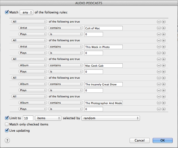
For this issue, Rune offers a different answer: Mix. We divided the process of organizing playlists into two steps: "including desired conditions" and "filtering out unwanted items," similar to making mixed juice with a blender. You can add all songs that meet the criteria at once. There's no need to remember all the details clearly; each input box comes with a search function that lists all options based on general information, and the right side will tell you in real-time what tracks the playlist contains.
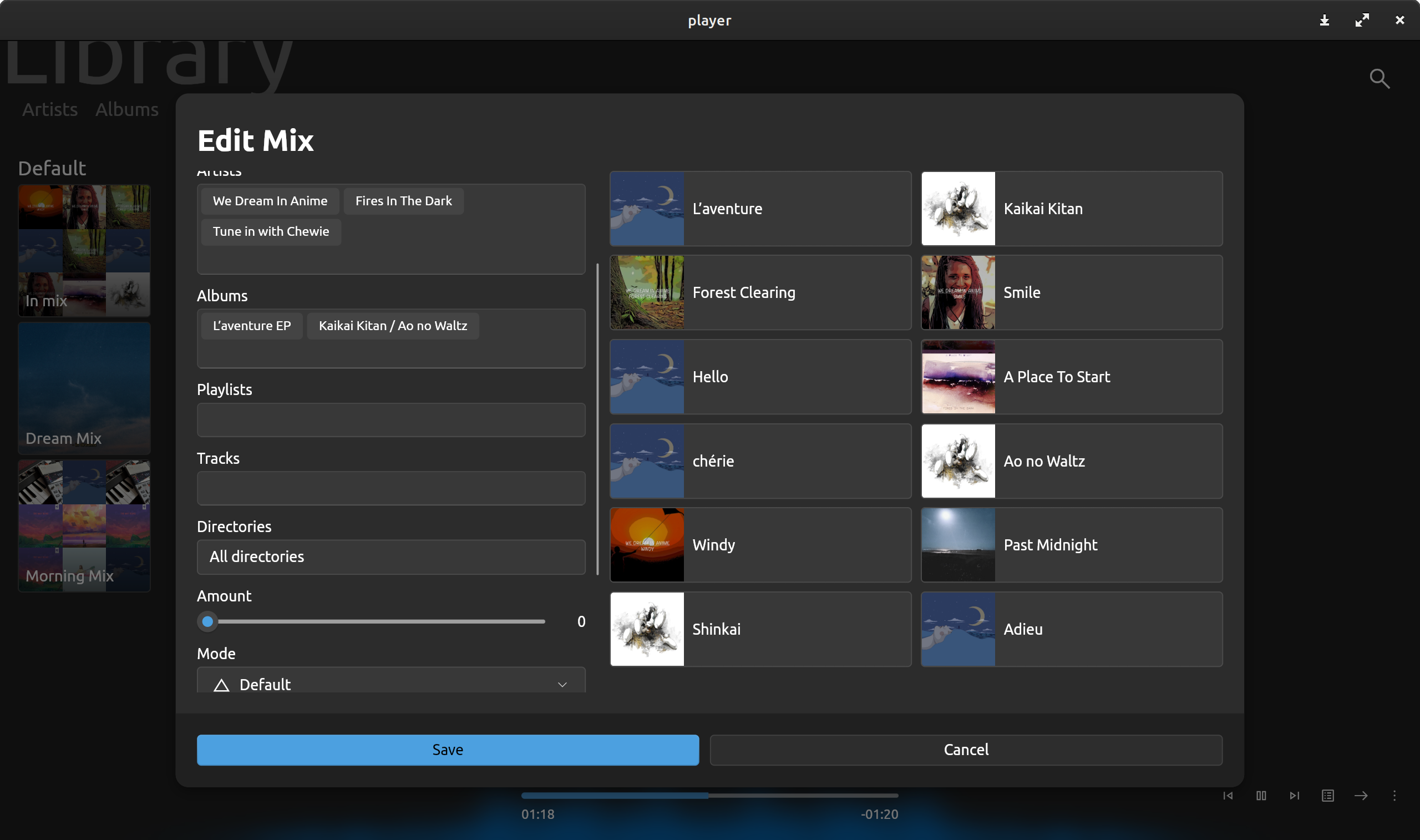
You can also do seemingly magical things: "Automatically shuffle when entering this playlist," "I like these albums and composers, please recommend similar tracks," "Sort by the number of times I've listened to the whole song, I want to repeatedly listen to the tracks I love."
It's not as versatile as an SQL editor. We consciously cut out confusing concepts like "logical relationship editing," hoping the final product is more intuitive and closer to your daily usage habits.
This feature is driven by a set of query syntax, which is simple and powerful. The only regret is the engineering implementation behind it, which is not ideal in terms of complexity or performance. I hope my backend engineering skills will improve to elegantly handle this issue, but for now, this is the best I can do.
Obsessive Management
Finally, I'd like to discuss open source with you.
Rune is an open-source software based on the relatively permissive MPL license.
MPL allows source code under its license to be mixed with files under other licenses, including proprietary ones. However, files licensed under MPL must maintain the MPL license and remain open source. This clause makes MPL neither as permissive as MIT and BSD licenses, which allow derivative works to become entirely proprietary, nor as restrictive as GPL, which requires all derivative works, including new components, to remain under GPL.
Wikipedia
For individual developers, open-sourcing software is a risky move, as you face the danger of being forked, rebranded, having ads inserted, or being monetized by others. There have even been tragic cases in the industry where those who forked the project forgot to change the contact information on the about page, resulting in a flood of negative reviews criticizing ads pouring into the original repository.
I fully understand this situation, just as I understood the risk of piracy when I published "Survival Guidance for Contemporary Students" and still chose to release it on Booth.
Living organisms, including humans, are driven by purpose. Everything we do is inevitably motivated by something. My motivation is to please myself, not commercial interests. If more money could flow in to help improve my life, that would be great, but it's not a big deal if it doesn't. I won't feel cynical or self-pitying because of this; I calmly accept all the consequences of these actions.
With this motivation, open-sourcing is the best decision for me personally and for Rune. I don't lose anything by doing this, but you, the readers, will have the opportunity to gain a deeper understanding of this uniquely styled software and potentially project the values we collectively care about onto this distinctive work.
After completing the basic architecture design, I began assigning version numbers for each development cycle, implementing small features and fixing minor bugs in each cycle. This complete control over the project's direction is wonderful, and the process of filling out development logs every night brings a constant dopamine rush. It's as if I've constructed a miniature world of my own, and I am its creator deity.
A sense of control is crucial. In my humble opinion, the root of all subjective motivations is a sense of control. Whether it's an open-source project or a closed-source one, a non-profit project or a commercial venture, the core purpose behind it is to shape the surrounding and internal environment, and the final product is always about having a say in specific matters. This influence might be about changing external things or about having the power to stabilize one's inner world.
Ultimately, those projects abandoned halfway through meet their end because the factors determining core value are no longer controllable by the initiator. This could be due to disappointment from failing to meet vague expectations, or from incorrectly assessing one's own boundaries and being overwhelmed by excessive responsibilities and workload.
With a clear understanding of my own management capabilities and the nature of the project, I chose a mildly dictatorial and obsessive open-source community governance strategy:
- English is the only supported working language: Being able to use English in some form (including through large language models) is a basic qualification for a competent developer. Almost all mainstream products in the open-source world have English as the default language for their source code and documentation. Members who cannot effectively use these resources or communicate using this "de facto standard" should be excluded from the community.
- Hasty feature requests are not accepted: For the vast majority of open-source projects, the initiator is that poor CPU 0, which is extremely draining on enthusiasm. Especially when encountering immature "participants" who irresponsibly propose unrealistic demands, responding in a "highly socialized" manner consumes a lot of time. Therefore, I don't plan to be that CPU 0; I only plan to work on features I care about. Of course, if developers want to add new features themselves or make a "feature-related deal" by "completing certain workloads," I'm happy to accept.
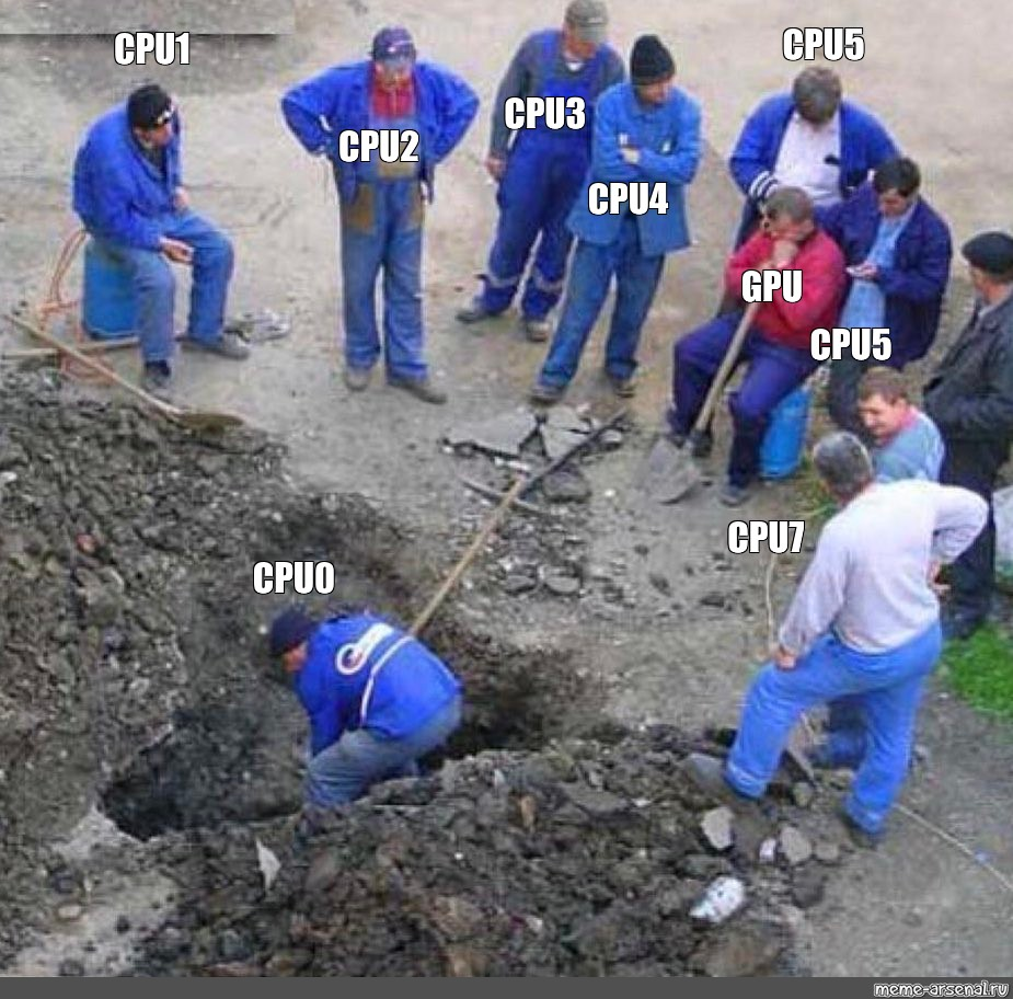
This governance strategy may seem very selfish, but if one can't take care of oneself, how can one maintain a work and meet users' expectations for it? "I still love this project" is more important than anything else because it is the foundation for continuing the project's life. And a feeling of "working for the whole world without any reward" is a significant killer of emotional resources.
We have witnessed countless times the scene where the main person in charge leaves, everyone scatters, and chaos ensues. The last thing I want to see happen to Rune is such an ending. The final period of this project must be punctuated by myself, in a good state of mind, in a satisfactory manner.
Conclusion
At this point, the Rune project is halfway complete, and as the project's "midterm presentation," I have sincerely expressed all the thoughts in my heart. Everyone has their own judgment about the merits of the work, and this answer sheet is open for your evaluation.
If you've read this far, you might find that I'm a very "picky" or even somewhat "fastidious" person. Perhaps you've already guessed that "misanthropic" is the most apt description of me—I fairly dislike everything and everyone in this world.
I used to really hate this aspect of myself. But now, I choose to accept it and try my best to turn the various dissatisfactions in my heart into meaningful results.
"Survival Manual for Contemporary Students" "Alice! Run!" and "Rune" are all works produced under this principle. They may not be astonishing, but I like them, and I even hope to engrave these works into glass to use as a base for my urn. Perhaps in my remaining years, I will continue to produce similar works, hoping that these works can help me face the inevitable final demise with equanimity.
Gentle as mist, free as the wind. I gave this project a Chinese name: 符石聆音 (roughly translates to "Rune Listening"), which embodies all my imagination and expectations for it. May you take me back to that afternoon with a gentle breeze, letting me see once again the people I once loved.
This work is dedicated to the memory of RealOne, Winamp, Zune, AirPlay, and those beautiful times that we can never return to.
 What Should the Zune Player Look Like in 2024?